
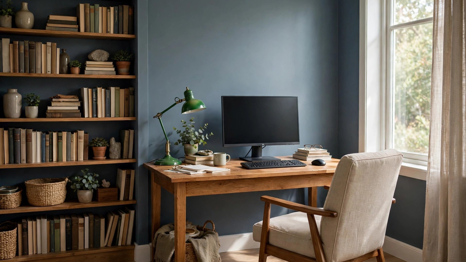

You spend more waking hours looking at your office walls than at almost any other surface in your life, so the color on them is not a trivial decision. The right office paint color ideas can make a workspace feel calm on a deadline day, sharp on a presentation morning, and professional on every video call in between. The wrong color can quietly do the opposite for years, which is why so many people feel vaguely drained by rooms they cannot explain.
Office color works differently from color elsewhere in the home. It has to support concentration for hours, behave under artificial light all day, suit screens and paperwork, and in a home office, still belong to the house around it. That is a longer job description than any living room wall ever gets.
This guide sorts office colors by the work they do: blues for concentration, greens for eye comfort, neutrals for professional calm, and accents for energy. It also covers the modern office realities older guides ignore, like video call backgrounds, tiny spare-room workspaces, and shared corporate floors. You will finish with a shortlist and a way to test it during an actual workday, which is the only test that counts for this room.
How Color Affects Focus, Mood, and Energy at Work
The modern office exists because work benefits from a dedicated environment, a fact built into the very history of the office as a workplace. Within that environment, color is one of the few variables fully in your control, and studies of workplace perception consistently find that people rate their mood, and even their sense of how demanding a task feels, differently under different wall colors.
The broad pattern is reliable even if individual taste varies. Cool colors (blues and greens) are associated with calm, clarity, and sustained attention. Warm colors are associated with energy and sociability, which helps in brainstorming spaces and can distract in deep-focus ones. Very saturated colors of any family raise stimulation; muted, gray-leaning versions lower it. For most knowledge work, muted wins, because the screen already supplies plenty of stimulation.
Brightness matters as much as hue. Very dark rooms can feel sleepy by mid-afternoon; stark white rooms can feel clinical and cause glare fatigue beside bright monitors. The productive middle is a mid-light palette: enough depth to feel grounded, enough light reflectance to keep you alert.
Treat these as starting principles, not laws. A designer who thrives in a coral studio and an accountant who needs blue-gray calm are both right about their own brains. The sections below give you the families; your testing day will pick your shade.
Calm Blues for Concentration
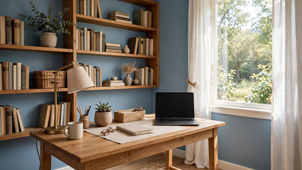
Blue is the most recommended office color on earth, and the reputation is earned. Soft and mid-tone blues are linked with clear thinking and lower perceived stress, they recede visually so small offices feel calmer rather than smaller, and they look professional on camera. If you do analytical, technical, or writing work, blue is the safest first family to sample.
Within blue, the gray-leaning shades work hardest. Slate blue, dusty blue, and blue-gray deliver the concentration benefits without the nursery or beach-house associations of clearer blues. They pair with white and light wood desks in modern offices, and with dark wood and brass in traditional ones.
Navy deserves its own mention. A navy wall behind the desk creates a focused, library-like backdrop that makes monitors and faces stand out on calls. In a small office, one navy wall with the remaining walls a soft warm white gives you the mood without the cave risk. In a large office, navy on all walls with good lighting and light furniture feels executive rather than dark.
Avoid very pale icy blues in north-facing offices, where they can turn cold and slightly sad by afternoon. If your office faces north, pick the blue with the most gray or a hint of green in it; both warm the family without leaving it.
Greens That Are Easy on the Eyes
Green is the color human eyes process with the least strain, sitting in the middle of the visible spectrum, and that simple fact makes it a natural office color. Sage, eucalyptus, and soft olive walls feel restful during long screen days and connect the room to whatever is outside the window, a small but real antidote to indoor fatigue.
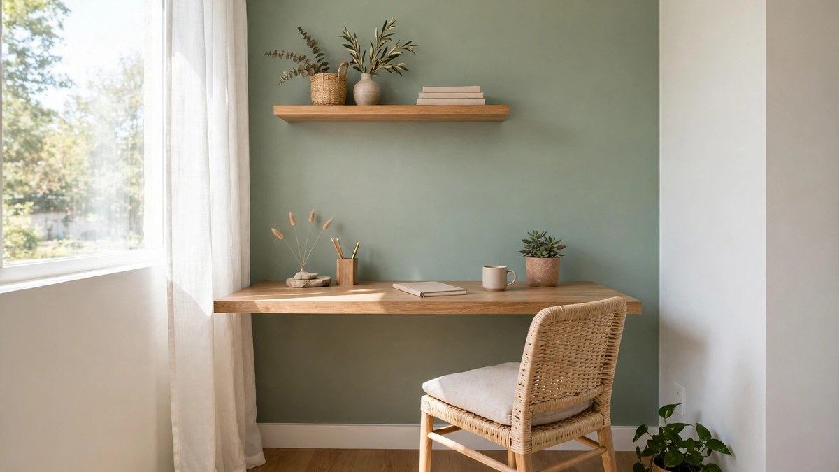
Sage and gray-greens are the office-ready versions. They are muted enough to stay professional, green enough to feel alive, and they flatter the wood desks and black tech that fill most workspaces. A sage office also transitions beautifully if the room doubles as a guest room, since the same palette reads as a calm bedroom at night.
Deeper greens — forest and hunter — make handsome studies and executive offices, especially with brass, leather, and warm task lighting. They are the choice when the office should feel like a library that happens to hold a computer.
Green has one caution: under some fluorescent and cheap LED lighting, certain greens can pick up a sickly cast. Test your finalist under your actual office lights, at your actual working hours, before committing gallons to the wall.
Warm Neutrals for a Professional Backdrop
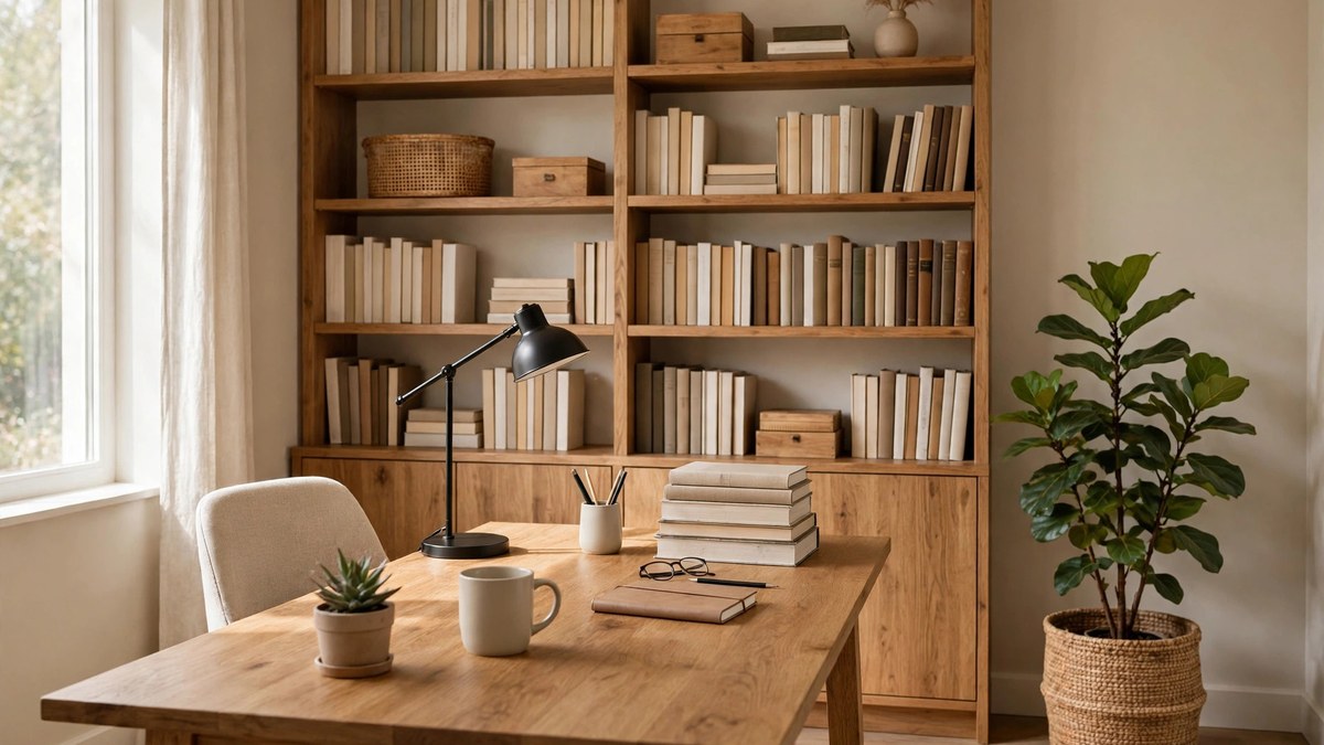
Warm neutrals — greige, warm white, soft taupe, and pale beige — are the quiet professionals of office color. They offend no client on a video call, they agree with every desk material, and they let art, diplomas, and shelving carry the room’s personality. If your office is client-facing, rented, or shared with the rest of the household, neutrals are often the smartest money.
Their secret weapon is flexibility. A warm neutral office can become energizing with a rust-colored chair and bold art, or serene with pale wood and linen, without a single repaint. When your work or your taste changes faster than your paint schedule, neutrals are the colors that keep up.
Choose the depth carefully. In a bright office, a mid-tone greige prevents washout and glare. In a dim one, warm white or the lightest greige protects your alertness. Our broader office decor ideas show these neutral backdrops carrying whole workspaces, which is useful calibration when a swatch looks boringly plain in isolation. Plain is the point: the backdrop should make you and your work look like the subject.
Avoid cool blue-grays masquerading as neutrals in north-facing offices; they are the shades most likely to feel chilly by 4 p.m. If a “neutral” sample has a blue cast on the chip, it will have a bigger one on your wall.
Energizing Accents: Yellow, Coral, and Terracotta
Sometimes the job is not calm but spark. Creative work, collaborative spaces, and the home offices of people who fight the afternoon slump can all benefit from warm, stimulating accents. The dose is what matters: energizing colors succeed as one wall, a painted bookcase, or the inside of shelving, and overwhelm as four walls in small rooms.
Soft yellows and marigolds are the classic creativity accent, associated with optimism and idea generation. Use the muted, slightly golden versions rather than lemon-bright ones, which can vibrate beside screens. Coral and terracotta deliver similar warmth with more sophistication, and they pair naturally with the warm neutrals and wood tones most offices already have.
A reliable formula is the 80-20 office: 80 percent calm base (neutral, blue, or sage) and 20 percent energizing accent placed where you see it when you look up from the screen, not behind the monitor where it competes with your work. The accent becomes a destination for your eyes during thinking breaks, which is exactly when you want the energy.
If your work is client-facing on video, keep the accent off the wall directly behind you or choose its muted version. A saturated wall behind your head will tint how clients literally see you.
Dark and Moody Offices That Mean Business
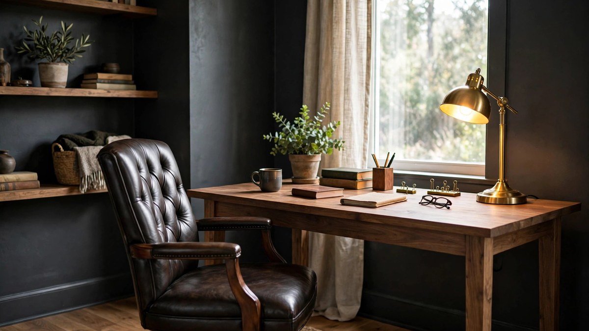
Dark offices have moved from gamble to classic. Charcoal, deep navy, forest green, and even near-black walls can make a workspace feel focused, private, and expensive, especially in rooms with good windows where daylight balances the depth. The psychology is cocooning: dark walls recede, distractions fade, and the desk becomes the lit stage where work happens.
Success depends on lighting discipline. Dark walls absorb light, so plan a strong task lamp, a warm ambient source, and ideally natural light from at least one window. Without them, a dark office slides from focused to sleepy by mid-afternoon. Light furniture and a pale rug or ceiling keep enough contrast for your eyes to rest.
Dark paint also flatters traditional offices: wood desks, leather chairs, brass lamps, and bookshelves full of actual books all look richer against depth. If your office furniture is mostly white and modern, dark walls still work, but the mood turns gallery-like and dramatic rather than library-like.
Worried about commitment? Test the darkest shade on the wall behind your desk first. It is the wall you see least while working and the one that transforms the room most on calls and when you walk in.
Paint Colors for Video Call Backgrounds
Video calls have added a new critic to office paint: the webcam. Cameras exaggerate saturation, flatten depth, and render some colors strangely, so the wall behind you deserves its own test. Mid-tone, muted colors perform best: slate blue, sage, greige, and warm mid-neutrals all read as professional without stealing focus or casting odd reflections on your face.
Avoid two extremes behind you. Stark white blows out on camera and can make you look shadowed by contrast. Very saturated colors, especially reds and bright greens, can bleed into skin tones and distract everyone on the call. If your favorite shade is bold, put it on the wall you face instead of the wall behind you.
Do a real test: paint the sample, sit in your chair at your usual call time, and record a short video of yourself talking. Check that your face looks natural and the wall reads calm, not loud. Ten minutes of this saves you from a year of apologizing for your background. Our office decor guide covers the rest of the on-camera setup, from shelving to lighting angles, once the paint is right.
Matte and eggshell finishes are your friends on camera, since satin and glossier paints can throw a visible sheen stripe under office lighting. Save the higher sheens for trim and doors outside the frame.
Small Home Office Paint Ideas
The small home office — a spare-room corner, a converted closet, a landing desk — has to feel like a workplace inside a few square feet, and paint is its cheapest boundary. The standard advice, light colors to enlarge, is half right. Light, low-contrast schemes do make small offices feel airier and are the safe default for windowless nooks, where anything deep can feel like a cave by noon.
The other half: a defined color can make a tiny workspace feel intentional rather than apologetic. One mid-tone or deep wall behind the desk, with the remaining walls light, creates a “room within a room” that helps your brain clock in. Our collection of home office ideas for small spaces shows this zoning trick in several real layouts.
Whichever direction you choose, keep the ceiling light and bright, keep the palette to two colors maximum, and let the desk area share at least one tone with the rest of the home so the workspace belongs instead of clashing. Small offices also benefit from painting built-ins and the desk wall the same color, which erases visual clutter lines that make tight spaces feel busier than they are.
Shared and Corporate Office Colors
Corporate and shared offices play by different rules: many people, many tastes, brand considerations, and long hours under standardized lighting. The palettes that survive those conditions are muted blues, blue-grays, warm grays, and soft greens — colors with enough gray in them to stay calm at scale and inoffensive across a whole floor.
Brand color belongs in accents, not on every wall. A company’s vivid brand hue usually makes a poor wall color at scale, reading loud and fatiguing across an open plan, but it works beautifully on one feature wall, in a lobby, or inside meeting-room niches where its energy is an event rather than an environment.
In shared spaces, consistency is a feature. One wall color across the floor, with variation delivered by flooring, furniture, and art zones, feels professional and keeps future repainting simple. Where teams need identity, vary the accents per zone rather than the base paint.
Do not forget the lighting you cannot change. Corporate fluorescents and cool LEDs push colors cooler and flatter, so sample in the actual space and lean a half-step warmer or deeper than the chip suggests. A color that looks perfect in a sunny showroom can vanish under office tubes.
Two-Tone Walls and Accent Walls in Offices
Two-tone schemes give offices structure. A deeper color below a chair rail or picture rail with a lighter shade above grounds the room, hides scuffs where chairs and bags hit, and keeps the eye-level zone bright near screens and faces. It is a traditional scheme that suits wood furniture particularly well.
The modern version splits differently: one full accent wall, usually behind the desk or behind the seating, in a deeper or richer color, with the other walls a coordinating light neutral. This gives home offices a focal point and video callers a designed backdrop without darkening the whole room.
Color blocking can also zone an open room: the office corner painted in a mid-tone blue or sage that stops cleanly at a corner, separating work from living without a partition. The cleaner the edge, the more designed it looks, so tape carefully and consider ending the color at a natural break like a doorway or bookcase.
Whichever scheme you choose, sample the two colors together on one board. Their relationship — the contrast between them — is what you will actually live with, and it cannot be judged from separate chips.
Finishes and Sheens for Office Walls
Offices are high-touch environments: chairs roll into walls, bags swing, hands steady themselves in doorways. Finish choice should reflect that. Eggshell is the practical default for office walls, offering a soft look that still wipes clean. Satin is better for high-traffic shared offices, kids-doing-homework offices, and anywhere walls meet chair backs daily.
Matte and flat finishes look sophisticated and photograph beautifully, hiding drywall flaws, but they mark more easily. Reserve them for low-traffic home offices with good walls, and keep leftover paint for touch-ups, because you will need it.
Trim and doors typically take satin or semi-gloss for durability and a subtle outline of the architecture. On camera, keep wall finishes at eggshell or below near your backdrop to avoid a sheen stripe, as noted earlier. Whatever finish you pick, buy the quality tier: office walls get cleaned more often than bedroom walls, and cheap paint shows it within a year.
Mistakes to Avoid
The first office paint mistake is choosing a color that fights your light. Stark white in a dim office turns gray and depressing; saturated color under cool LEDs can vibrate for eight hours a day. Test in the room, under work lighting, during a workday.
Second is forgetting the camera. A gorgeous room with a terrible call background is a modern professional problem. Test the wall behind your chair on video before the paint is final.
Third, painting all four walls a deep or saturated color in a windowless office. Without daylight to balance it, the room shrinks your energy by afternoon. Take the bold color to one wall and let the others breathe.
Finally, treating the office as an afterthought room that gets the leftover paint from another project. You work here daily. The office deserves the same sampling discipline as the kitchen, because its color affects more of your hours than any other room’s.
Frequently Asked Questions
What is the best paint color for a home office?
Muted blues and sage greens are the most recommended, because they support concentration and stay easy on the eyes through long screen days. Warm greige is the safest neutral alternative. The best color for you is the one from those families that survives a full workday test under your own lights, next to your actual desk setup.
What colors should I avoid in an office?
Avoid very saturated brights on all four walls, which can feel fatiguing over long hours, and stark blue-white in dim rooms, which turns gray and chilly. Also avoid high-gloss wall finishes near your video backdrop, because they create distracting glare stripes on camera.
Does blue really help concentration?
Blue is consistently associated in workplace perception research with calm, clarity, and focus, and it is the most chosen color for analytical workspaces. The effect is about mood rather than magic: a room that feels calm and clear makes sustained attention easier to maintain. Gray-leaning blues tend to work best because they stay professional.
What is the best background color for video calls?
A muted mid-tone: slate blue, sage, warm greige, or a soft mid-neutral. These read as professional, keep your face looking natural, and avoid the blowout of white walls and the distraction of saturated ones. Test with your actual camera and call lighting before finalizing.
Should a small home office be light or dark?
Light and low-contrast is the safe default, especially without windows. But one mid-tone or deep wall behind the desk can make a small office feel intentional and zoned rather than cramped. Keep the ceiling bright, limit the palette to two colors, and test the deep wall before committing to all four.
Can I use my company’s brand color on my office walls?
In accents, yes; as the main wall color, usually with caution. Brand colors are designed for logos and screens, so at wall scale they often read louder and more fatiguing than expected. Use the brand color on one feature wall, inside shelving, or in furniture and art, over a calm base that suits long workdays.
What finish is best for office walls?
Eggshell is the practical default, balancing a soft look with wipeability. Satin suits busy shared offices and walls that chairs rub against. Keep finishes at eggshell or below on your video call wall to avoid glare, and use satin or semi-gloss on trim and doors for durability.
Conclusion
Office paint color ideas are really work-design decisions. Blues buy you concentration, greens buy you eye comfort, neutrals buy you flexibility and professionalism, and accents buy you energy. The right purchase depends on the work you do, the light you do it in, and the camera that now watches you do it.
Shortlist one color from the family that matches your work, test it through a real workday and one real video call, and then commit. A considered office color pays you back every single day, in the currency of hours that feel a little easier.
