


Bare walls are the most common unfinished note in American living rooms, and it is rarely because people do not care. It is because art feels risky: the sizes are confusing, the hanging heights are folklore, and nobody wants to drill holes for a piece they might not love in a year. The result is rooms full of good furniture facing blank drywall. These living room wall art ideas are here to end that, with clear rules for scale, height, arrangement, and sourcing that work whether your budget is twenty dollars or two thousand.
Here is the encouraging truth first: there are very few true mistakes in wall art, and almost all of them are about size and height rather than taste. Get those two things right and nearly any art you genuinely like will look intentional. This guide covers the statement piece, the gallery wall, mirrors, textiles, ledges, and budget sources, then finishes with the exact measurements professionals use, so you can hang with confidence instead of hope.
Start With Scale: The Rule That Fixes Most Walls
If one rule could reform every living room wall in the country, it is this: go bigger. Art that is too small for its wall or its furniture is the number one decorating error professionals name, and it makes even beautiful pieces look like accidents. Above a sofa, a single piece or a grouping should span roughly two-thirds of the sofa’s width. For an 84-inch sofa, that means art covering about 55 inches across, far more than most people first imagine.
On an empty wall with no furniture below, art should claim a presence proportional to the wall itself. A lone 16-by-20-inch frame on a 12-foot wall is not minimalism; it is a postage stamp. Either commit to one large piece, think 36 by 48 inches and up, or compose a grouping that together reaches a similar footprint.
Scale also explains why grouping small pieces works: a tight gallery of small frames reads as one large artwork. If your collection is small pieces, that is your strategy. If you own one big piece, let it stand alone with breathing room. What never works is the middle error, medium-small art floating in a large expanse with no relationship to anything. Measure your wall and your furniture, do the two-thirds math, and write the target dimensions down before you shop for anything.
The Single Statement Piece
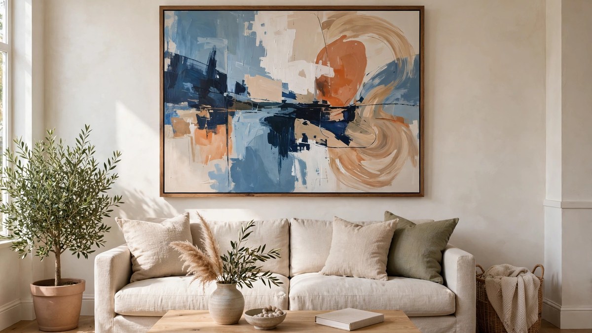
One large piece over the sofa is the cleanest, most confident wall treatment there is. It gives the room a focal point, simplifies every other decision, and rewards buying the best piece you can afford, because it will carry the room essentially alone. Abstracts, landscapes, large-scale photography, and textile pieces all work; the subject matters less than the scale and your genuine response to it.
Choosing the piece is personal, but hanging it is technical. Center it over the furniture below, not over the wall as a whole if the furniture is off-center. Leave about 6 to 8 inches between the top of the sofa back and the bottom of the frame, so the two read as one composition rather than separate events. A picture frame with real presence, a substantial molding and a mat, elevates even a print into looking like art with a capital A.
Oversized on a budget is achievable. Large prints and posters in standard poster frames, a big canvas print of your own photograph, or a vintage textile stretched on a frame all deliver scale without gallery prices. If you love the bolder, layered end of decorating, our artistic living room ideas show how a statement piece becomes the seed for an entire room’s palette.
Gallery Walls That Look Curated, Not Crowded
The gallery wall is the statement piece’s sociable cousin: many pieces, one composition. It suits collectors, families with photographs to show, and anyone whose art arrives in small sizes. The curated look comes from planning and consistency, not from owning matching art.
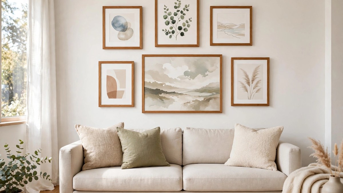
Plan on the floor or with paper templates taped to the wall first; this step is non-negotiable. Arrange the largest piece first, slightly off-center, then build outward with the smaller pieces, keeping the outer edges of the whole group roughly rectangular or deliberately shaped. Keep spacing tight and consistent, about 2 to 3 inches between frames, because even spacing is what makes unrelated pieces read as one installation.
One practical upgrade transforms existing groups: unify the frames over time. A gallery wall collected over years often wears a dozen frame styles, and that visual static is what makes it read as clutter. Reframing the whole group gradually into one finish family, or simply painting mismatched wooden frames the same color, is a weekend project that makes a scattered wall look like it was hung by a gallery. Start with the largest frames and work down as budget allows; the improvement is visible from the first three.
Consistency comes from one unifying thread: frames in one or two finishes, mats in the same white, or art within one color family or era. Mix everything else freely: photographs beside paintings beside a small mirror or a woven piece. Hang the group’s center at eye level, about 57 inches from the floor, treating the whole arrangement as a single artwork for height purposes. Our maximalist decor guide shows gallery thinking at its most abundant if you want to push the density further.
Decorating Living Room Walls Beyond the Frame
Frames are only the beginning of decorating living room walls, and some of the most interesting rooms get their texture from objects instead. Plates, baskets, hats, masks, wooden utensils, vintage tools, and musical instruments all hang beautifully and bring a dimensional, collected quality that flat art cannot. Woven baskets and fans in a relaxed cluster suit organic and boho rooms; a disciplined grid of plates suits traditional ones.
Architectural salvage deserves its own mention: an old window frame, a piece of carved molding, ironwork, or shutters used as wall pieces add history and heft. So do large-scale natural pieces, a dramatic branch arrangement in a floor vase reaching into the wall space, or a hanging planter grouping that turns the wall into a garden.
Textiles, covered fully below, and mirrors, likewise, belong in this category of beyond-frame thinking. The principle unifying them: a wall wants dimension, color, and a story, and plenty of objects besides framed prints can supply all three. If your walls feel flat, it may not be more art you need; it may be one object with real depth and shadow.
Mirrors as Art: Light, Depth, and Reflection
A mirror is the hardest-working wall piece in decorating because it is simultaneously art, window, and lamp. It reflects light into the room, doubles the view of whatever sits opposite, and adds the sparkle that flat art cannot. Placed opposite or adjacent to a window, a large mirror can noticeably brighten a dark living room, which is why designers reach for them in north-facing spaces.
Choose what the mirror will reflect as carefully as the mirror itself. A mirror facing a cluttered corner doubles the clutter; one facing a garden, a bookshelf, or a chandelier doubles the best thing in the room. Round mirrors soften rooms full of rectangles, which is most living rooms, and a sunburst or sculptural frame turns the mirror into the statement piece outright.
Leaning is the mirror’s relaxed mode. A large mirror leaned on a mantel, a sideboard, or even the floor against the wall has a deliberate, gallery looseness, and it avoids both holes and the commitment of a centered hang. Leaned mirrors also angle their reflection slightly upward or downward depending on placement, which lets you fine-tune what they double. Secure any leaned piece that stands where children or pets pass; beauty should never be a tipping hazard.
Scale rules apply as they do to art: over a mantel, about two-thirds to three-quarters of the mantel’s width; over a sofa or console, about two-thirds of the furniture width. Groupings of small mirrors work like a gallery wall and suit collectors of vintage frames. Just be honest about the reflection at sitting height; a mirror that mainly reflects the ceiling fan is a missed opportunity.
Textiles on Walls: Tapestries, Quilts, and Woven Pieces
Textile hangings bring what framed art cannot: softness, sound absorption, and scale at low weight. A large tapestry, a vintage rug, a quilt, or a woven fiber piece can cover a statement wall’s worth of space while weighing a fraction of a framed canvas, which matters for renters and for walls that resist anchors.
Hanging methods vary by piece. A sewn rod pocket or a wooden dowel through loops gives a clean, tailored drop for tapestries and quilts. Clips and a wire suit lighter weavings. For a rug, a proper mounting board with Velcro strips distributes the weight safely. Keep valuable textiles out of direct sun, which fades dyes measurably over a single season, and rotate prized pieces if they hang in bright rooms.
Textiles also solve the echo problem in hard-surfaced rooms. A large weaving on the wall opposite the windows softens sound the way curtains and rugs do, and a living room that sounds calm feels calmer. Choose pieces whose colors already live in your palette, or let one spectacular textile set the palette for the whole room; both approaches are proven.
Shelves and Ledges: Art You Can Rearrange
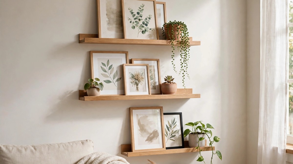
Picture ledges and shallow shelves are the commitment-free answer to wall art. A ledge holds frames leaning casually, overlapping slightly, in arrangements you can change in five minutes without touching a nail. Two ledges at staggered heights make a display wall that evolves with your collection, your seasons, and your whims.
Style ledges the way stylists style shelves: vary frame heights, mix one horizontal piece among verticals, layer a small frame in front of a larger one, and leave some air between groups. Prop one object, a small sculpture, a plant, a ceramic, among the frames to break the flatland effect. Our guide to decor for shelves covers the styling ratios in depth.
Floating shelves with more depth can hold books and objects as well as frames, turning a wall into a library moment. Keep shelf groupings disciplined, though: the ledge’s charm is its edited look, and a ledge crowded end to end with small frames becomes visual noise. Edit ruthlessly, rotate the surplus, and the wall always looks fresh.
Art on a Budget: Posters, Printables, and Your Own Photos
Great walls do not require gallery budgets; they require scale and intention. Museum exhibition posters are real graphic design with pedigree, and standard-size poster frames keep the total cost low. Downloadable prints from independent artists, printed at a local shop on decent paper, cost a fraction of framed retail art and support the artist directly.
Your own photographs are the most underused art source in the house. A travel landscape, an architectural detail, or a portrait of your own garden, printed large and simply framed, outperforms generic store art because it is yours. Black-and-white printing unifies a mismatched set of photos into a gallery-worthy group instantly.
Your own walls may already hold a supply you have forgotten: the calendar with twelve good prints, the art book with plates worth framing, the maps and botanical illustrations sold cheaply as vintage paper. Framing one strong page from a beautiful book is an old decorator’s trick and entirely legitimate when the book is yours and falling apart anyway. Look at your shelves before you look at a store; some of the best-loved pieces in real homes began life between covers.
Secondhand sources overflow with frames and art: thrift stores, estate sales, and flea markets sell frames for a few dollars that would cost fifty new, and the art inside can be replaced, painted over, or kept if you love it. Buy the frame, not the picture, and your budget stretches to true statement scale.

Hanging Heights and Spacing, Demystified
The numbers professionals use are few and simple. The center of a piece or grouping should sit at about 57 inches from the floor, the average eye level used by galleries; in rooms where people mostly sit, err slightly lower rather than higher. Over furniture, hang the piece so its bottom edge sits about 6 to 8 inches above the furniture’s back or top, close enough to read as one composition.
For gallery walls, keep gaps consistent at 2 to 3 inches. For a pair or row, treat the set as one unit: center the unit at 57 inches and keep the same 2-to-3-inch gaps. Over a mantel, center the art on the mantel itself, not the wall, and let its width run about two-thirds to three-quarters of the mantel shelf.
Hardware matters as much as height. Use picture hooks rated above the piece’s weight rather than bare nails, and two hooks for wide pieces so they stay level. On plaster or drywall with heavy pieces, find studs or use proper anchors; a fallen 40-inch canvas is a decorating setback and a safety issue. Measure twice, mark with painter’s tape, and step back to the doorway before drilling anything.
Choosing Art for Your Color Palette
Art can lead the palette or follow it, and both orders work. When art leads, pull two or three of its colors into your textiles and accents and let the walls stay neutral enough to serve as the gallery. This is the boldest and most personal route, and it guarantees the room’s colors mean something.
When the palette already exists, choose art that contains at least one of its colors in a meaningful amount, so the piece converses with the room rather than shouting over it. The shared color does not need to dominate the artwork; a minor note repeated in a cushion is enough to stitch them together. Black-and-white art and photography are the universal donors: they fit nearly every palette and rest the eye in colorful rooms.
Beware the opposite trap, matching too perfectly. Art bought to match a sofa’s exact shade looks like a furniture-store vignette. A little productive tension, a color in the art that appears nowhere else but sings against the palette, is what makes a wall look collected rather than coordinated.
Common Wall Art Mistakes to Avoid
The hall of fame starts with art hung too high, floating near the ceiling with a gulf between it and the furniture it belongs to. Bring it down to eye level and the room instantly looks professionally done. Second is the too-small piece alone on a big wall; either scale up or group up. Third is the scattered constellation, small frames peppered over every wall with no grouping, which reads as indecision rather than abundance.
Fourth, ignoring the reflection test for glass and mirrors: check what the piece shows from the main seats. Fifth is hanging everything dead-center on every wall, which flattens a room’s rhythm; asymmetric groupings and one off-center statement keep the eye moving. And sixth, drilling before planning. Paper templates and painter’s tape cost nothing; holes are forever, or at least require spackle and humility.
Frequently Asked Questions
How high should I hang art above a sofa?
Hang it so the bottom of the frame sits about 6 to 8 inches above the sofa’s back, with the art spanning roughly two-thirds of the sofa’s width. If the piece is small, group several pieces to reach that width rather than raising a single small frame higher, which only makes it look lost.
What is the 57-inch rule for hanging art?
Galleries hang art so its center sits at about 57 inches from the floor, which matches average eye level. Apply it to single pieces and to the center of groupings. In rooms where everyone is usually seated, you can hang a few inches lower without breaking the effect.
How do I choose between one big piece and a gallery wall?
Choose one big piece if you own or can find a single work you love at scale; it is simpler and bolder. Choose a gallery wall if your art is small, varied, or photographic, or if you enjoy rearranging. Both approaches fail only when they are undersized for the wall.
Can I mix photographs with paintings on one wall?
Yes, and the mix is usually more interesting than either alone. Unify them with consistent frames or mats, keep spacing even at 2 to 3 inches, and consider printing photographs in black and white if their colors clash with the paintings. Treat the entire group as one artwork for placement and height.
Where can I find large art cheaply?
Museum posters, downloadable prints you frame yourself, your own photographs printed large, and secondhand frames from thrift stores and estate sales are the reliable routes. A textile or tapestry also delivers large scale cheaply, since even a big woven piece costs less than a framed canvas of the same size.
How do I hang heavy art safely?
Weigh the piece, use picture hooks or wall anchors rated above that weight, and hang wide pieces from two hooks so they stay level. On drywall, use toggle or molly anchors for heavy pieces and studs when possible. Never hang anything heavy over a bed or sofa from a single nail.
What if I am a renter and cannot make holes?
Use picture ledges resting on furniture, lean large pieces on consoles and mantels, and use rated removable hooks for lighter frames, testing them first. Many landlords also allow a few small nail holes; ask before assuming. A well-leaned, well-lit piece looks intentional, not temporary.
Final Thoughts
Walls get finished by decisions, not by budgets. Pick the scale the wall actually needs, hang at eye level, group small things into one big statement, and let at least one piece be something you truly love. Start with the wall your seating faces and the rules in this guide; once that wall sings, the rest of the room will ask for the same treatment, and you will know exactly how to give it.
