
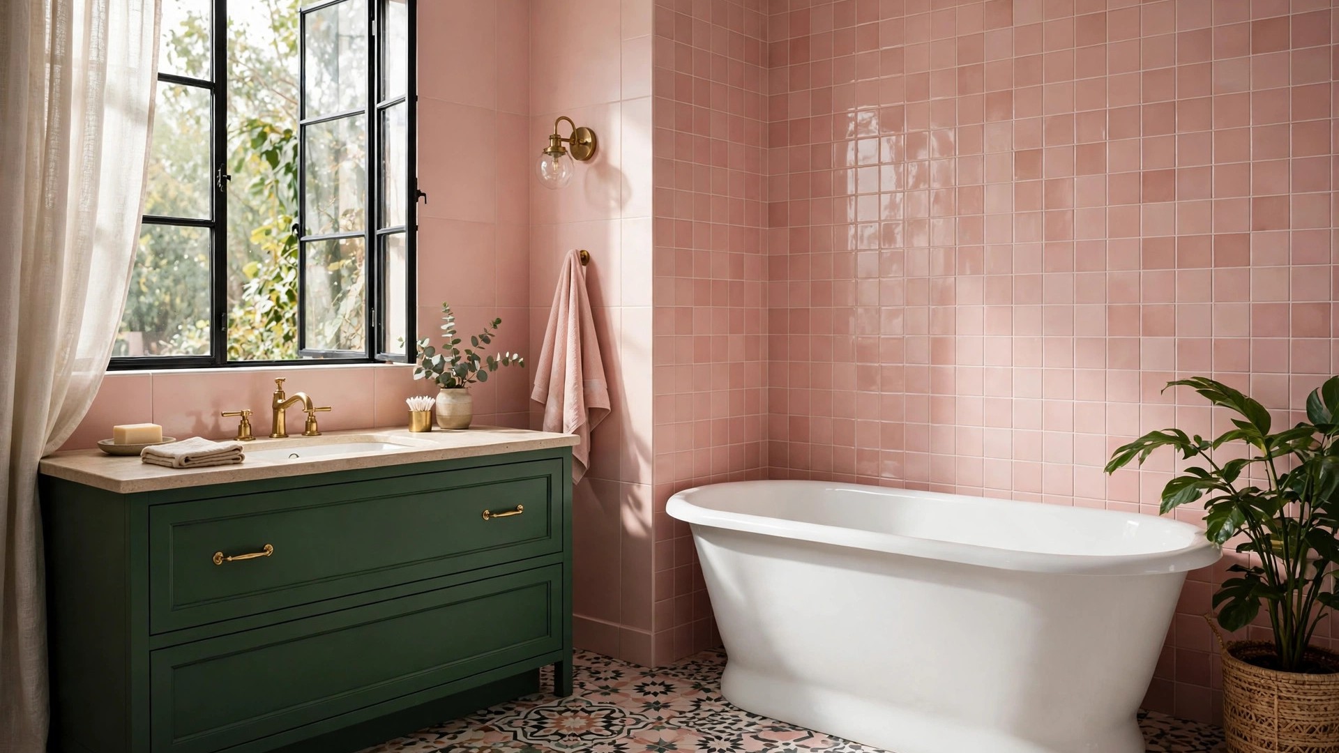

A bathroom is the smallest room in most homes, which is exactly why color works so well in it. A bold shade that might overwhelm a living room feels exciting in a space you use for twenty minutes at a time. These colorful bathroom ideas are for anyone tired of the all-white box: renters who need reversible changes, renovators choosing tile, and homeowners who simply want a room that sparks a little joy before coffee. You will find palettes, paint tricks, tile ideas, and low-commitment accents, organized so you can pick the level of boldness that suits you.
The good news is that color does not have to mean chaos. The most successful colorful bathrooms follow a plan: one hero color, a supporting cast, and enough neutral breathing room for the eye to rest. Start there, and everything else in this guide falls into place.
Why Color Works So Well in a Bathroom
Bathrooms are naturally forgiving places to experiment. The surfaces are hard and washable, the fixtures are usually white (a built-in neutral), and the door closes — so a daring choice never has to coordinate with the whole house. Designers routinely test strong color in powder rooms and guest baths before committing to it anywhere else.
There is a practical side, too. Many bathrooms have small windows or none at all, and flat white paint under cool artificial light can look gray and chilly. A saturated color actually reads richer in these conditions. Warm tones make morning light feel kinder, and deep tones turn a plain box into something that feels intentional, almost like a boutique hotel.
Finally, color is the fastest lever you own. Paint is cheap, towels and shower curtains are cheaper, and even tile — the most permanent choice — covers far less square footage here than in a kitchen. The risk-to-reward ratio is better in the bathroom than anywhere else in the house.
There is also a mood argument that anyone who has started a gray day in a gray bathroom understands: color is a small daily pleasure, delivered twice a day, in private. A coral wall does not change your life, but it reliably changes the first ninety seconds of it. When designers talk about “joy” in interiors, this room — used constantly, shared rarely, and finished quickly — is where the return on joy is highest per dollar spent.
Start With a Color Palette, Not a Paint Can
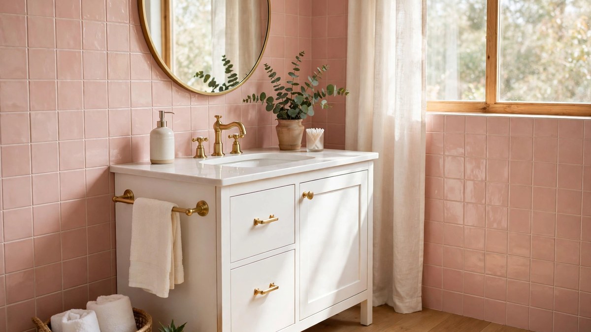
Every great colorful bathroom starts with a palette of roughly three colors: a dominant color, a secondary color, and a small accent. The classic 60-30-10 guideline applies here — about 60 percent of the room in the main color, 30 percent in the secondary, and 10 percent in an accent that shows up in towels, art, or a stool.
If you are new to combining colors, a quick grounding in color theory helps more than any trend list. Colors opposite each other on the wheel (blue and orange, green and red) create energy; colors next to each other (blue, teal, green) create calm. Most beginner-friendly bathrooms use the calm, analogous route and add contrast through black, white, or brass.
A reliable method is to steal a palette from something you already love: a patterned shower curtain, a piece of art, even a favorite shirt. Pull the main shade for walls or tile, the second shade for the vanity or floor, and let the pattern’s brightest note become your accent. If you want ready-made combinations organized by mood, browse these bathroom themes and note which palettes you react to — your gut reaction is good data.
Pink Bathroom Ideas That Range From Soft to Bold
Pink is the color people ask about most, and the range is wider than you might think. At the soft end, blush and dusty rose behave almost like neutrals. Paired with white marble-look tile and brushed brass, a blush wall reads warm and sophisticated rather than sweet. It is a lovely choice for a primary bath where you want calm with personality.
In the middle sit the rosy terracottas and salmon tones. These earthy pinks flatter skin tones in the mirror — a genuinely practical reason to choose them — and pair beautifully with warm wood vanities, cream tile, and black accents that keep the look grounded.
At the bold end, hot pink and magenta work best in small, controlled doses or in tiny powder rooms where drama is the whole point. A fuchsia vanity against deep green walls is a showstopper, but it needs confident supporting choices: simple mirrors, minimal clutter, and metals that match throughout.
Practical notes for pink: pink tile is permanent, so if you are unsure, get the look with pink paint (easy to change) and pink textiles first. And test paint on the wall, not a swatch — pink shifts dramatically under warm bathroom bulbs, sometimes toward orange.
Blue and Teal: The Other Colorful Classics
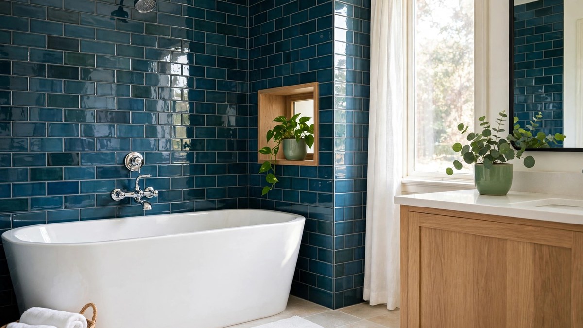
Blue is the most requested bathroom color in America, and for good reason: it echoes water, reads clean, and spans from powdery sky to near-black navy. Navy vanities with white countertops have become a modern classic because the contrast is crisp and hides everyday wear well.
Teal and peacock blue-green shades add a jewel-box feel, especially in glazed ceramic tile where the color pools and shifts across each piece. These shades love brass and warm wood, and they make white fixtures glow by comparison.
For a full walk-through of these shades — including which blues suit small baths and which pair best with gray floors — see our dedicated guide to blue bathroom ideas. The short version: go one shade deeper than you think you want. Bathrooms eat light, and pale blues often read washed out once installed.
Green Bathrooms: Botanical and Fresh
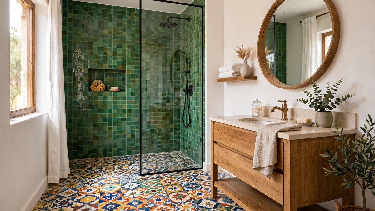
Green is the color of the moment in bathroom design, and it earns the hype. Sage green walls create a soft, botanical calm that flatters every skin tone and pairs with almost any metal finish. Deeper forest and emerald greens feel luxurious, particularly in tile with a glossy finish that bounces light around.
Green also has the best supporting cast of any color family. Live plants — a pothos trailing from a shelf, a humidity-loving fern near the tub — literally match the palette. Natural textures like rattan baskets, teak stools, and linen curtains complete the spa-adjacent look without trying too hard.
If a full green room feels like too much, try green in one strong place: a tiled shower wall, a painted vanity, or a patterned floor tile with green woven through it. One saturated moment, surrounded by warm white, is often more striking than green everywhere.
Warm Colors: Terracotta, Peach, and Sunny Yellow
Warm colors make windowless bathrooms feel like morning. Terracotta and clay tones bring an earthy, Mediterranean warmth that suits handmade-look tiles, plaster-effect paints, and unlacquered brass that patinas over time. They are especially kind in bathrooms with warm wood floors or vanities.
Peach is the sleeper hit: softer than orange, warmer than pink, and famously flattering in mirror light. A peach wall with white wainscoting and chrome fixtures looks fresh and slightly retro. Apricot tones also bridge beautifully between pink and terracotta palettes.
Yellow needs a careful hand but rewards it. Butter and marigold shades in small doses — a painted ceiling, a striped shower curtain, a vanity front — energize a room without overwhelming it. Avoid greenish yellows under fluorescent light, and always check the color at night under your actual bulbs before committing to walls.
Colorful Tile That Does the Heavy Lifting
Tile is where colorful bathrooms get serious, because tile is expensive to change. The safest strategy is to let tile deliver pattern and let paint deliver the big color — or the reverse — but rarely both at full volume in the same plane.
Options worth considering:
- Glazed ceramic in a saturated color — the glaze creates depth that flat paint cannot match.
- Patterned cement-look porcelain — delivers a colorful floor with family-friendly durability.
- Colorful grout — white tile with colored grout (pink, blue, mustard) is a budget-friendly middle path.
- A tiled accent wall behind the vanity or in the shower — one wall of color, three walls of calm.
Floor tile is the best place for pattern because you see it in glancing light and it hides water spots and hair well. Wall tile is the best place for saturated color because it sits at eye level. Decide which job you want done, then choose accordingly. If wallpaper is more your speed than tile, these bathroom wallpaper ideas cover the bold-pattern route in depth.
A word on upkeep before you fall for colored grout or handmade-look tile: saturated glazes can show soap film more than white does, and cement or cement-look tiles need sealing on the schedule the maker specifies — typically at installation and then periodically in wet zones. None of this is difficult, but colorful bathrooms look their best when the surfaces are actually clean, so choose finishes your household will realistically maintain. A glossy, wipeable tile in a bold color beats a matte artisanal one that is forever dusty with toothpaste spots.
Fixtures, Vanities, and Colorful Cabinets
A painted vanity is the single most effective color move in most bathrooms. It is a contained piece of furniture, it sits at the room’s visual center, and painting it costs a fraction of replacing it. Deep green, navy, burgundy, and even red vanities are all having a moment, and a dated oak vanity is the perfect candidate for a weekend transformation.
Use proper prep — clean, sand, prime with a bonding primer — and a durable enamel or cabinet paint in satin. Two thin coats beat one thick one. Swap the hardware while you are at it: new pulls in a contrasting metal can change the whole personality of the piece for under fifty dollars in many cases.
Beyond the vanity, look at the fixtures themselves. Matte black faucets anchor bright colors; brushed brass warms them; chrome keeps things crisp and classic. Colored sinks and tubs exist, too — a colored exterior on a freestanding tub is a bold but contained statement. Just remember the rule: one hero. If the tub is the star, let the walls be quiet, and vice versa.
One question worth settling early is resale. Buyers’ agents used to advise stripping every trace of color before listing, but a single tasteful colorful bathroom — especially a powder room — rarely hurts a sale and often makes the listing photos memorable. The genuinely risky choices are permanent and personal at once: bright mosaic tile in the primary bath, a colored toilet. If resale within a few years is likely, keep permanence neutral and put personality into paint and textiles, which a weekend can reverse.
Small Bathroom? Color Strategies That Open the Space
You may have heard that small bathrooms must be white. The truth is more interesting: what matters is not lightness but consistency. A small bath painted one continuous color — walls, trim, even the ceiling — loses its visible seams and feels larger than the same room chopped into white walls and a colored accent.
That said, light-to-mid tones are more forgiving in tiny spaces with no window. Pale sage, dusty blue, soft peach, and warm greige all brighten without the starkness of pure white. Gloss and satin finishes bounce what little light exists, which is why glossy tile is such a friend to small baths.
If you love dark colors, a small powder room is actually the best place for them — dark walls in a tiny room read as cozy and dramatic rather than cramped, especially with a bright mirror and good lighting. Save the darkest shades for rooms guests visit briefly, and keep family workhorse bathrooms lighter for practical tasks like makeup and shaving.
Mirrors and lighting multiply whatever color strategy you choose in a small bath. A mirror that spans the vanity wall-to-wall bounces the wall color around the room and doubles its effect, letting you use a gentler shade for the same impact. Frosted or warm bulbs soften saturated colors; harsh daylight bulbs exaggerate them. In a small bathroom, think of mirror and light as the volume knob for the color you picked.
Accessories: The Rent-Friendly Way to Add Color
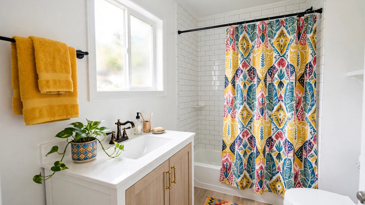
If you rent, or simply like to change your mind, accessories are your color strategy. A full, saturated look is entirely possible without touching paint or tile, because bathrooms are mostly seen in layers: towels, curtain, bath mat, and countertop items fill a surprising percentage of the visual field.
- Shower curtain: the largest single block of color in most baths — treat it like a mural.
- Towels: buy two coordinated sets in your accent color; they read as deliberate design.
- Bath mat and window shade: echo the curtain color to tie the room together.
- Art and a small plant: one framed print and one pot in the palette colors finish the job.
- Countertop pieces: a colored soap dispenser, tray, and toothbrush holder cost little and read as intentional.
The trick is discipline: choose your three-color palette and let every accessory obey it. Random rainbow clutter reads as messy; three colors repeated five times reads as designed. When you tire of the palette, the whole scheme changes in an afternoon for the cost of a curtain and towels.
Color Mistakes to Avoid
A few errors show up again and again in colorful bathrooms. The first is using too many hero colors at once — five saturated shades competing at equal volume exhausts the eye. Pick one star and let the rest support.
The second is skipping the light test. Bathroom lighting is notoriously unflattering — often a single overhead fixture or cool bulbs that shift every color. Test paint as a large swatch on two walls and check it morning and night before buying gallons.
Third, forgetting the fixed elements. Your floor, tub, and toilet impose colors you cannot easily change: almond or bone fixtures fight bright white tile, and gray-veined marble clashes with warm yellow walls. Build the palette around what is staying, not around a photo of someone else’s bathroom with different bones.
Finally, ignoring ventilation. Saturated paints in satin or semi-gloss hold up to steam far better than flat finishes, and colorful grout needs sealing in wet zones. Pretty is only useful if it survives the shower.
Choosing Color by Bathroom Type: Powder, Guest, and Primary
Not every bathroom wants the same dose of color. The powder room is the sprinter: tiny, visited briefly, and seen by guests — it can carry the boldest color in the house, even a dark jewel tone or a wild wallpaper, because nobody has to apply makeup in it. If you are nervous about color, start here; success in the powder room builds decorating courage for the rest of the house.
The guest bathroom sits in the middle: welcoming and characterful, but it must work for visitors who did not choose it. Mid-tone colors, one strong feature (a painted vanity, a patterned floor), and clear, bright light at the mirror keep it charming without risking usability. This is also the room where a colorful hand towel set makes the fastest impression for visiting family.
The primary bathroom is the marathon runner: you use it half-asleep, at dawn, every day. Choose colors you find restful at your least awake — most people land on softer, grayer versions of their favorite hues here. Put the boldness in one replaceable place (towels, art, a stool) and keep walls, tile, and vanity in the calmer register, so the room can be both personal and peaceful at 6 a.m.
Frequently Asked Questions
What is the most popular colorful choice for a bathroom?
Blue remains the most popular, especially navy and soft dusty blue, because it suits most homes and reads clean. Green — particularly sage — has risen fast in the last few years, and pink is the favorite for powder rooms and playful primary baths.
Can I use dark colors in a small bathroom?
Yes. A small powder room in a deep color often feels intentional and cozy rather than cramped. In a small full bathroom you use daily, mid-tones are safer for grooming light, but dark tile or a dark vanity works well when balanced by bright fixtures and good lighting.
How do I add color if I rent my home?
Focus on textiles and accessories: a bold shower curtain, coordinated towels, a bath mat, art, and countertop pieces in one repeat palette. Peel-and-stick tile and removable wallpaper are also widely used by renters, but check your lease and test removal in a hidden spot first.
Which colors make a bathroom look bigger?
Continuous color makes a bathroom look bigger more than any single shade: one color across walls and trim removes visual seams. Light-to-mid tones like pale sage, dusty blue, and warm greige help in windowless rooms, and glossy finishes bounce light further.
Should my bathroom color match the rest of the house?
It does not need to match, but it should not clash with whatever is visible through the open door — a hallway or bedroom wall color that fights the bathroom palette will bother you daily. Bathrooms are the accepted place to go bolder than the rest of the home.
What finish should colorful bathroom paint be?
Satin is the workhorse for most bathroom walls; semi-gloss suits very steamy rooms and trim. Flat and matte finishes show water marks and mildew more easily in wet spaces, though modern washable matte formulas have narrowed the gap.
How many colors are too many in one bathroom?
For most people, three: a dominant color, a supporting color, and one accent, on a base of white or another neutral. You can stretch to four if one appears only in a pattern. Beyond that, the room usually starts to feel unsettled.
Final Thoughts
Color is not a risk in the bathroom — it is the room’s best opportunity. Choose a three-color palette, decide where the color will live (paint for flexibility, tile for permanence, accessories for renters), and let one hero shade do the talking.
Start smaller than your bravest idea if you are nervous: one painted vanity or one saturated shower wall will tell you quickly whether you want more. Most people who try a colorful bathroom wonder why they waited so long.
