
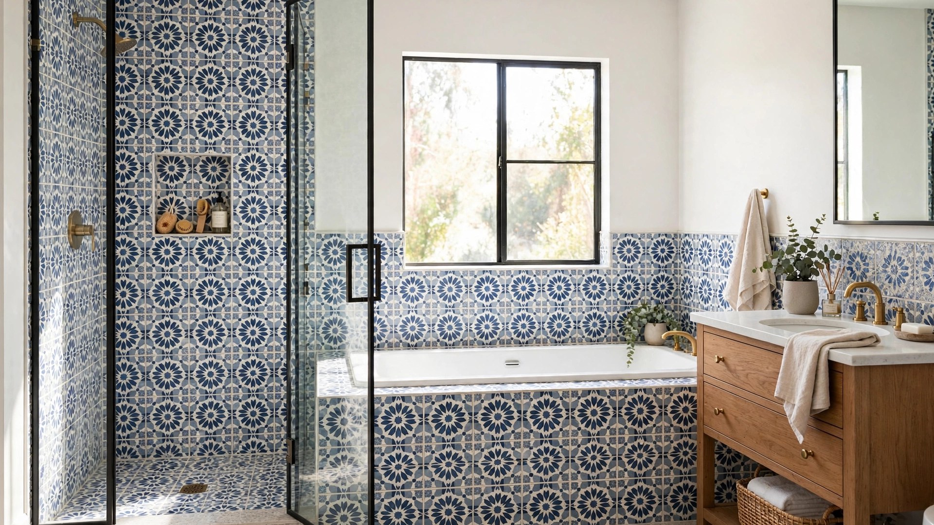

Tile is the bathroom’s permanent wardrobe. Paint can change in a weekend and towels in a wash cycle, but wall tile commits for a decade or more, which is exactly why it deserves the most thought per square foot of any surface in the room. The good news: bathroom wall tile ideas have never been richer, from handmade-look subway and zellige to large-format porcelain slabs, mosaics, and stone, and the principles that make them work are learnable in one read.
This guide covers the material basics first, then works around the room, tub, shower, vanity backsplash, accent walls, with grout, pattern, and layout guidance and the mistakes that make good tile look cheap. Bring your room’s measurements; leave with a plan.
Tile Basics First: Materials, Sizes, and Finishes
Ceramic and porcelain dominate bathroom walls for good reasons. Porcelain is the denser, harder body, defined by water absorption of 0.5 percent or less, which makes it the premium choice for showers and wet zones; standard ceramic is lighter, less expensive, easier to cut, and perfectly happy on walls outside direct water. For wall applications specifically, both perform, so budget can follow beauty more than in floor decisions.
Natural stone, marble, travertine, slate, brings unmatched variation and a sealing contract: stone in a wet bathroom needs periodic resealing and gentler cleaners. Glass tile offers luminous color and total water indifference at the price of fussier installation. Cement and encaustic-look tiles deliver pattern with presence; true cement needs sealing and suits walls better than floors in wet rooms.
Size shapes everything. The classics endure: 3-by-6-inch subway, 4-by-4 squares, penny rounds and 1-inch hex mosaics for vintage notes. The modern field belongs to large formats, 12-by-24 inches and far beyond, up to porcelain slabs measured in feet, which minimize grout and maximize calm. Match the format to the wall: small walls choke on giant tiles that need endless cuts, while vast walls make small tiles buzz.
Finish follows function. Glossy tile bounces light and wipes clean, a gift in dark rooms and splash zones. Matte and textured tiles feel current and hide water spots better but can hold soap film. In the shower, a slight texture anywhere hands and products land is a kindness; on dry walls, choose purely by eye.
For a compact reference on how these materials relate, from glazed ceramic and porcelain to glass and terracotta, Wikipedia’s overview of tile traces the whole family and its production methods.
Bathroom Tile Inspiration: Five Directions That Never Fail
When choice paralyzes, steal a direction. These five families of bathroom tile inspiration account for most of the bathrooms people save and pin, because each one is a complete grammar, not just a pretty tile.
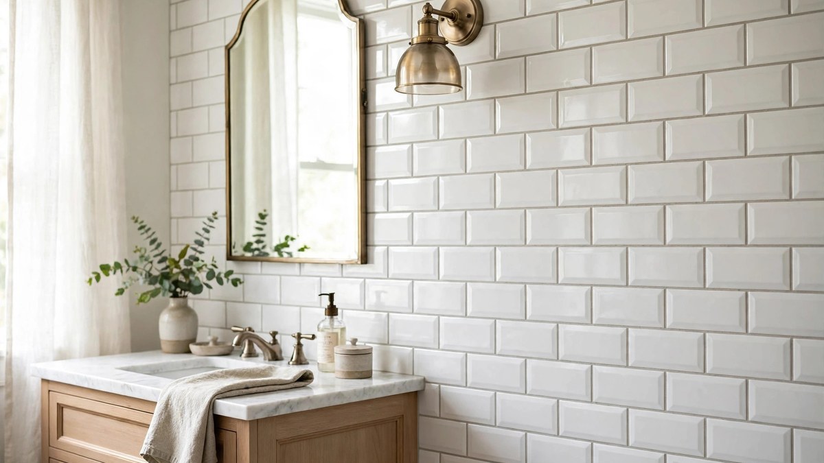
First, the timeless white field: subway or square ceramic, warm white grout or a whisper of contrast, letting fixtures and textiles carry color. It suits every architecture and never dates. Second, the spa stone look: large-format porcelain printed as marble, travertine, or limestone, run floor-to-ceiling, with matching tones in every other material.
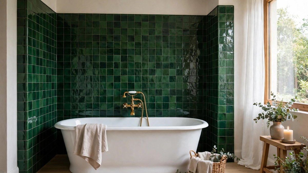
Third, the color-drenched wall: saturated ceramic in teal, forest, ink, or terracotta, usually in a vertical stack or a handmade-look finish, against quiet floors and white fixtures. Fourth, the vintage revival: hex mosaics, penny rounds, black-and-white patterns, and beveled subway that honor older houses. Fifth, the textural neutral: zellige-look, kit-kat (finger) mosaics, fluted and ribbed tiles in bone, sand, and clay tones, where light and shadow do the decorating.
Notice what the five share: restraint in the number of tiles per room, usually two, occasionally three, and a clear star. Choose your direction first; the specific tile is a detail the direction will decide for you.
Bathtub Tile Ideas for a Surround That Steals the Show
The tub surround is the bathroom’s largest tiled stage, and these bathtub tile ideas treat it that way. Running tile to the ceiling, rather than stopping at the traditional line above the showerhead, is the single most transformative choice: the surround becomes architecture, the room feels taller, and the eye stops noticing where the “shower part” ends.
Give the alcove a composition. One approach: field tile everywhere, with a contrasting band or a framed panel of accent tile centered on the long wall, echoing classic wainscot logic. Another: tile the end wall, the one you face from the door, in the room’s star material and keep the long walls quiet. A third: build a tiled niche into the surround at tub height for bath salts and candles, which turns storage into a framed still life.
For freestanding tubs, the tile belongs on the wall behind: a half or full wall of tile protects against splashes and backs the tub like a headboard. Protect honestly, tubs get splashed beyond their rims by children, dogs, and enthusiastic soakers, so carry waterproofing a generous margin beyond the tub’s outline and seal the floor joint meticulously.
Practical checks: keep a grab-bar-ready wall in mind, confirm the tub’s filler reaches over the rim with the tile thickness added, and choose a grout you can face cleaning in the room’s dampest corner. Beauty and bleach-ability are the same decision here.
Shower Tile Design Ideas That Make the Shower the Star
The shower is where tile budget earns its applause, and the strongest shower tile design ideas begin with a focal decision: one wall, usually the back or the fixture wall, gets the star tile, and the others support in a quieter, larger, or glossier field. This hierarchy keeps even bold patterns serene and gives the room a photograph’s composition.
Verticality is the current grammar. Vertically stacked subway, kit-kat mosaics running up, and long planks all stretch the walls upward, which flatters standard 8-foot ceilings. In a stall with a bench, run the star tile behind the bench and let it climb into the niche back, so the functional wall is also the beautiful one.
Ceiling decisions matter more than expected. Tiling the shower ceiling in the wall tile creates a grotto of calm, especially in steam showers where it is effectively required; painting it in a moisture-rated finish is the budget alternative. Either way, decide before the walls go up, because the tile’s top edge detail, a pencil trim, a Schluter edge, or a clean caulk line, is designed, not improvised.
Floors inside the shower follow different rules: smaller formats for grip and slope, detailed in our shower planning guidance, and a grout plan that assumes daily water. Choose the wall tile for love; choose the floor tile for physics.
Backsplash Ideas for Bathroom Vanities: Height, Edge, and Impact
The vanity backsplash is small in square feet and huge in consequence, because it sits at eye level and meets the mirror, the faucet, and your reflection every morning. These backsplash ideas for bathroom vanities start with height. The standard 4-inch splash matches the counter and reads minimal; extending tile to the mirror or ceiling creates a full feature wall that makes even a stock vanity look custom.
Continuity is the luxury move: run the countertop material up the wall as a slab backsplash, or extend the room’s star tile from the shower to the vanity so the whole bathroom shares one material story. In primary baths, a full-height tiled vanity wall with sconces mounted through it is the magazine shot, and it is mostly a matter of more of the same tile.
Edge details separate the designed from the defaulted. A tile that stops mid-wall needs a finished edge, a metal profile, a pencil liner, or a bullnose, chosen before installation. Where tile meets mirror, a clean caulk line in a matched color keeps the junction quiet; where it meets a side wall, decide whether the tile wraps the corner or stops with a trim piece.
Do not forget the splash’s job: it exists because water flies. In hard-water homes, glossy tile and light grout show spots less than matte stone; at the vanity specifically, sealed stone and porcelain shrug off the toothpaste-and-splash regime that defeats paint within a year.
Backsplash Vanity Ideas in Stone, Tile, and Slab
Beyond height and edge, the material itself offers a menu of backsplash vanity ideas worth comparing directly. Full-slab stone or porcelain, the countertop continued upward, is the calmest and most expensive: no grout, total waterproofing, and a surface that wipes in one pass. It suits modern and minimalist rooms and small powder rooms where its cost stays contained.
Tile backsplashes trade that seamlessness for pattern and price range: a handmade-look ceramic in a vertical stack feels artisanal, a marble mosaic feels classic, a bold geometric feels designed. Sheet mosaics install quickly and their many grout lines, an aesthetic feature, demand a grout color decision with real consequences, match for calm, contrast for graph paper.
The budget champions deserve their due: a single row of large tiles as a tall splash, peel-and-stick products kept out of direct spray for renters, and even a painted, properly sealed beadboard splash in a powder room all protect the wall and look intentional. What fails is the accidental backsplash, the 4-inch strip that matches nothing and protects little, installed because it came in the box.
Coordinate the splash with the faucet’s reach and the mirror’s placement before ordering anything; the most beautiful backsplash in the world looks wrong with a faucet spout that bonks it or a mirror floating oddly above it.
Accent Walls and Wainscot-Height Tile
Not every wall needs full tile, and the partial treatments are often the smartest design. A single accent wall, behind the vanity or the tub, in the room’s star tile, with the remaining walls in a quieter large-format or paint, concentrates budget and impact where eyes actually go. This is also the renter-to-owner upgrade path: one wall now, others in a later phase.
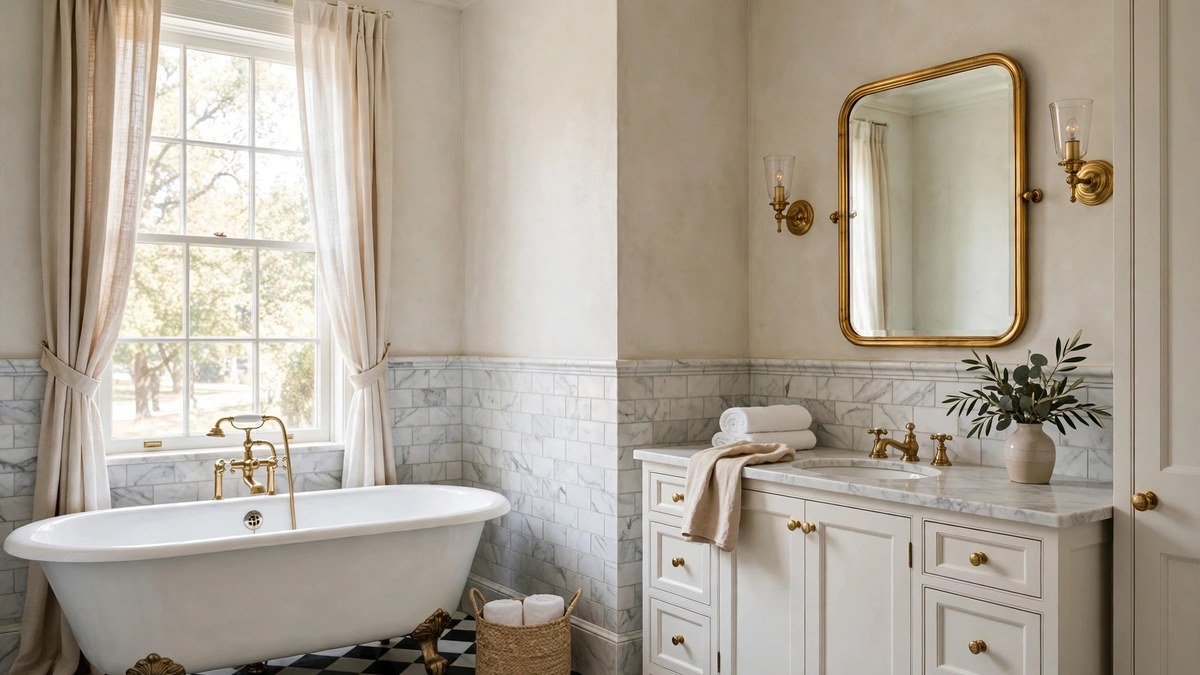
Wainscot-height tile, typically 36 to 48 inches, revives a classic bathroom architecture: durable, washable below, where hands, splashes, and chair-rail bumps live; paint or paper above, where personality can change cheaply. A cap rail or chair-rail trim finishes the transition, and the horizontal line organizes mirrors and art beautifully.
Half-tiled walls flatter small bathrooms especially, because the tile’s shine and the paint’s softness divide the room into calm bands rather than one buzzing field. In kids’ baths, wainscot tile is practically armor; choose a darker grout and the wall will look new for years of bath-time weather.
One caution: partial tile demands a deliberate top edge. Plan the trim piece, metal profile, bullnose, or a wood cap, as part of the design, because the edge is the detail everyone sees at eye level on the toilet wall and beside the door.
Floor-to-Ceiling Tile and the Wet-Room Look
Tiling every wall to the ceiling is the boldest commitment and, in the right room, the most serene: the bathroom becomes a single material envelope, cave-like in the best way, with nothing to repaint and nowhere for moisture to win. Porcelain slabs and large formats make it feasible without a grout-line migraine, and running the same tile on the floor completes the wet-room effect.
This look demands a confident, quiet tile; a busy pattern at full enclosure becomes a funhouse. Choose the tile you would still love as the only visual event in the room, in a tone that flatters skin, because the vanity mirror will reflect it all day.
The wet-room version extends the logic to layout: shower open within the tiled envelope, tub inside the wet zone, everything waterproofed. It is professional-grade waterproofing work, and in exchange it delivers the most architectural bathroom a residence can hold. Our bathroom renovation guide sequences the membrane and slope work that this look stands or falls on.
Cost honesty: full-height tile multiplies both material and labor, and corners multiply cuts. Many gorgeous rooms compromise at the “wet walls fully tiled, dry walls painted” line and lose nothing the eye can detect.
Grout, Pattern, and Layout: The Invisible Design Decisions
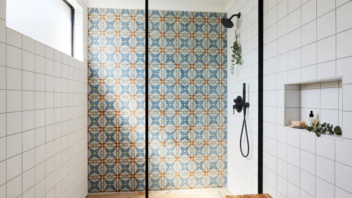
Two bathrooms with identical tile can look unrelated because of these three decisions. Grout color first: matching grout melts tile into a surface; contrasting grout draws the grid and makes pattern the point. Neither is superior, but the choice must be made on purpose, on a sample board, in your room’s light, because grout occupies more visual area than most people realize.
Joint width matters: tight joints, around 1/16 to 1/8 inch with rectified tile, read modern and minimize grout maintenance; wider joints suit rustic and handmade tiles whose edges wander. Sealed or high-performance grout in wet zones is worth its premium every time it meets a squeegee.
Layout patterns are the tile’s choreography: running bond (the classic offset), stacked (modern and calm), herringbone (energy and tradition), vertical stack (height and current fashion), basketweave and hex fields (vintage). The same 3-by-6 tile performs all five personalities; pattern is free style, so choose it last and choose it deliberately.
One technical note hides inside the layout choice: long tiles laid in a running bond can bow slightly, a manufacturing reality called lippage when edges sit unevenly, so installers commonly limit the stagger on large rectangular tiles to about a third of the tile’s length rather than the classic half. If your heart is set on a dramatic 50-percent offset with long planks, raise it with the installer before the first box is opened, not after the first wall is up.
The layout also has a planning dimension: a good installer centers the field on the room’s key sightline and hides cuts at edges and behind fixtures. Ask to see the plan, on paper or dry-laid, before thinset appears, because layout is the decision you will see every day and cannot unmake.
Tile Ideas for Small Bathroom Walls
Small bathrooms are tile’s favorite canvas because a single material decision covers the whole room, and the right one makes the space feel larger, not busier. Large-format tiles, counterintuitively, often win in small rooms: fewer grout lines mean fewer visual interruptions, and the eye reads calm, continuous surfaces as more space.
Gloss and light are your allies: a light, glossy tile on the walls returns light from every fixture and window, and running it to the ceiling stretches the room upward. The shower’s glass should be clear, not frosted, so the tiled interior counts as part of the room’s volume.
If pattern calls, answer at small scale and in one place: a mosaic floor with quiet walls, or a patterned accent behind the vanity with plain tile elsewhere. The transformations in our collection of modern bathroom ideas repeatedly use this one-star rule to keep compact rooms serene.
Avoid the doll-house effect of tiny tiles on every wall of a tiny room; the grout grid shrinks the space. And in small baths, grout color matching is not timidity, it is strategy: the fewer lines the eye counts, the bigger the room feels.
Common Bathroom Wall Tile Mistakes
The classic mistake is tile-count chaos: four or five tiles in one small room, each lovely, together a quarrel. Limit the room to two, rarely three, tile stories. Second is grout chosen on the truck at installation time, in the wrong light, defaulting to a contrast nobody designed. Decide grout from a sample board at home.
Third is waterproofing amnesia: tile and grout are water-resistant finishes, not waterproofing; the membrane behind them is the system. Fourth is ignoring the top edge and the corners, where unfinished cuts and sloppy caulk lines betray the whole wall at eye level.
Fifth is format folly: giant tiles butchered into slivers on a narrow wall, or busy mosaics where a calm field belonged. Sixth is slick large tile wandering onto the shower floor in someone else’s plan, a safety failure, not a style one. And seventh is forgetting the future: keep a labeled box of spare tiles and the grout color written down, because one cracked tile in year six should be a repair, not an archaeological expedition.
When a project is part of a bigger refresh, sequencing tile against vanities, glass, and fixtures is where budgets leak; a coherent plan, like the ones behind our bathroom remodel ideas, keeps the tile crew working once, not twice.
Frequently Asked Questions
What is the most popular bathroom wall tile right now?
Large-format porcelain that mimics marble and stone, and handmade-look ceramics like zellige in soft whites and colors, share the lead. Subway tile remains the perennial classic. All three succeed because they pair a calm field with interesting surface variation.
Should bathroom wall tile go all the way to the ceiling?
In the shower, yes, it looks best and protects most. Elsewhere it is a style and budget choice: full height feels architectural and serene; wainscot height with paint above is classic and lets you change color cheaply later.
What tile size makes a small bathroom look bigger?
Large tiles, 12 by 24 inches or bigger, with grout matched to the tile. Fewer lines read as more space. Keep pattern to one location and use glossy or satin finishes to return light.
Can I mix two tiles in one bathroom?
Yes, two is the classic formula: one star and one quiet field, sharing a tone or a material story. Three can work with discipline, a floor, a field, an accent. Beyond that, rooms usually start to quarrel.
What grout color should I choose?
Match the tile for a calm, continuous surface; contrast it when you want the pattern and grid to be the design. Always decide from a dried sample board in your own bathroom light, never from the bag or a showroom.
Is natural stone a good choice for bathroom walls?
It is beautiful and entirely viable with honest maintenance: sealing on schedule and gentle cleaners. Porcelain that imitates stone gives 95 percent of the look with none of the upkeep, which is why it dominates real projects.
How much does wall tile cost compared to paint?
Tile costs several times more in materials and labor and lasts several times longer. A common strategy is tile where water lives, shower, tub surround, backsplash, and quality bathroom paint elsewhere, which balances budget and durability well.
Final Thoughts
Bathroom wall tile rewards the deciders: pick a direction, anoint one star, match or contrast the grout on purpose, and finish every edge like it will be inspected, because at eye level, daily, it will be. Do that, and your tile stops being a surface and becomes the room’s architecture, the thing guests photograph and the thing you get to enjoy every single morning.
