
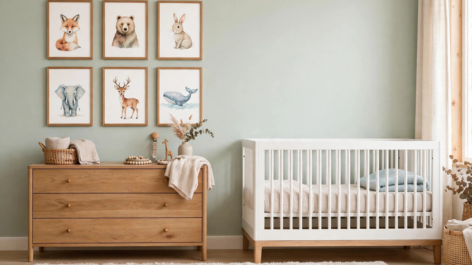

Of everything in a nursery, the walls get looked at the longest — by the baby gazing up from the changing table, by the parent rocking through the night, and by every visitor who peeks in. Choosing nursery wall art with a little thought pays off daily: the right pieces calm the room, feed a newborn’s developing eyes, and tell the first chapter of your child’s story.
This guide covers the practical side first — sizing, placement, and safety — then the joyful side: themes with staying power, gallery compositions, whimsical ideas, and budget-friendly ways to fill a wall beautifully. The goal is art that delights a baby now and still earns its place when the crib becomes a toddler bed.
Why Wall Art Matters More in a Nursery Than Any Other Room
Babies spend their waking nursery hours looking at walls and ceilings. In the first months, a baby’s vision is drawn to high contrast and simple shapes, so the print above the changing table is not decoration to them — it is entertainment, visual exercise, and one of their first experiences of the wider world beyond faces.
For parents, the art sets the room’s emotional temperature. You will see these walls at your most tired and your most tender, and gentle, well-chosen art makes the 3 a.m. feed feel like a moment instead of a chore. Nurseries are small, so a few pieces carry the entire scheme — which makes them the highest-leverage decor you can buy.
Art is also the easiest nursery element to evolve. Paint and furniture are commitments; a print swaps in minutes. Choose art with growth in mind, and the room updates itself over the years with nothing more than a step stool and a picture hook.
There is a quieter benefit, too: art gives the room its memory. Long after the crib is gone, the framed print from above it carries the whole era with it. Parents routinely keep one nursery piece forever — choose and hang yours knowing it may end up being that piece.
Sizing and Placement: Getting the Basics Right
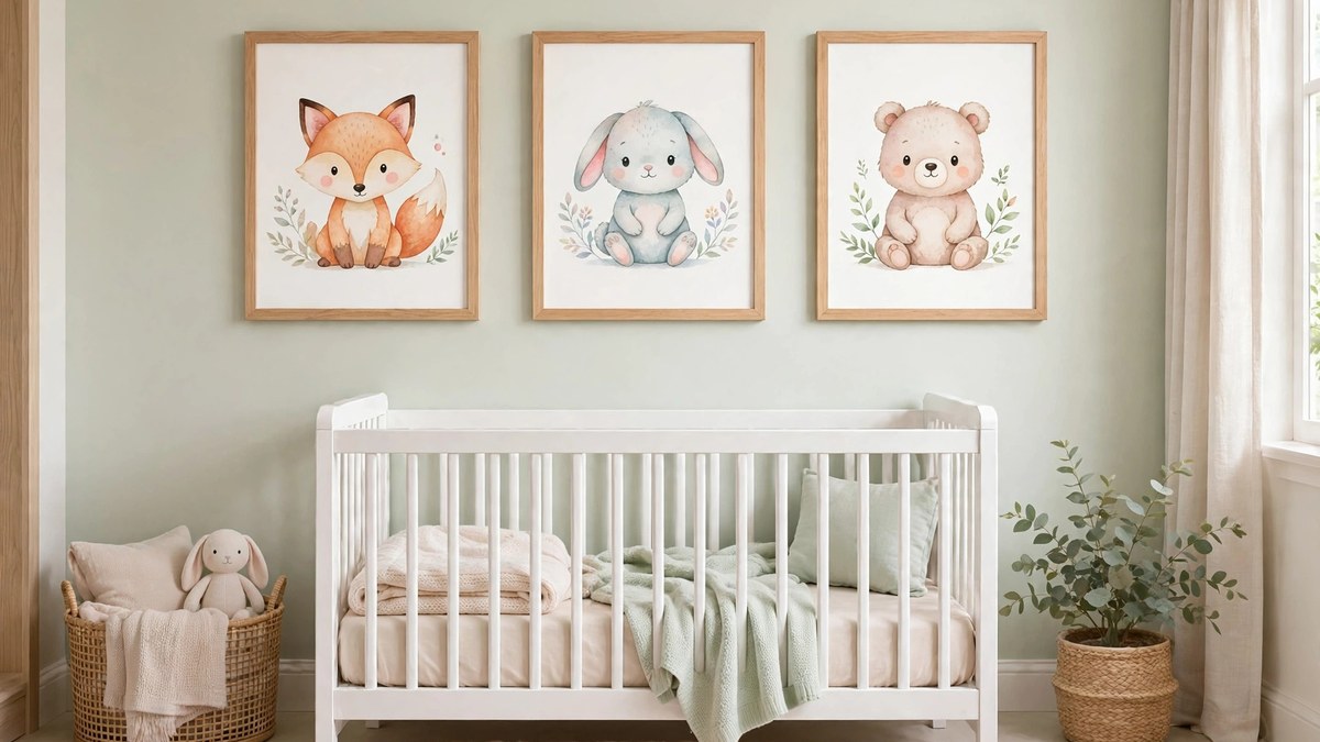
The most common nursery art mistake is going too small. A single small print floating on a big wall reads as an afterthought. As a general guide, the art arrangement above a crib or dresser should span roughly two-thirds the width of the furniture below it, and pieces for a nursery often look best larger than your instinct — 16 by 20 inches and up for hero pieces.
Height matters as much as size. Hang the center of the art at adult eye level — typically around 57 to 60 inches from the floor — rather than pushing it up toward the ceiling. In a nursery, also consider the seated view from the nursing chair: the art you will actually live with is the art visible from that chair.
Leave breathing room between pieces in a grouping — about 2 to 3 inches is a common spacing — and between the art and the furniture below, so the arrangement reads as one composed unit. When in doubt, tape paper templates to the wall first and live with them for a day; repositioning tape is free, nail holes are forever.
Baby Girl Nursery Wall Decor With Staying Power
Traditional baby girl nursery wall decor — ballet pinks, ballerinas, and “dream big, little one” lettering — is sweet, but much of it expires by age three. The versions with staying power keep the softness and lose the expiry date: blush and dusty rose used as a palette rather than a theme, botanical prints, vintage storybook illustrations, and gentle rainbows in muted tones.
Nature subjects are the bridge. A set of watercolor wildflowers, woodland animals in soft rose-tinted palettes, or a large single print of a flamingo or swan reads unmistakably “hers” at six months and simply “lovely” at six years. Pair with cream, sage, or warm grey walls and the room evolves with bedding changes alone.
Personalization adds years, too. Her initial in a beautiful frame, a star chart from her birth night, or a print of a place that matters to your family will never feel babyish. If you did the broader room planning with a guide like our baby room decor roundup, this is the layer where “girl” becomes “her.”
For a softer, more grown-up variation, look at French and vintage storybook illustration: Beatrix Potter-style watercolors, antique botanical plates of roses and peonies, and ballet prints in sepia rather than pink. They deliver all the romance of a girl’s nursery in a register that a ten-year-old would still choose for herself.
Whimsical Nursery Ideas for Walls That Spark Imagination
Whimsical nursery ideas start from a simple premise: walls can tell stories. A painted or decal mural of rolling hills with a tiny hot-air balloon, a set of prints following one character’s adventures across the wall, or clouds and stars arranged as a night sky over the crib corner — each gives a child a world to grow into.
Three-dimensional touches deepen the magic. Small wooden stars, a felt garland strung high, floating shelves shaped like clouds holding board books — these turn a flat wall into a landscape. Keep every element secured and well out of reach, and the wall becomes the room’s storybook.
Whimsy ages best when it has one foot in classic design. A storybook mural in a restrained palette, or character prints in matching frames, keeps the wonder while sparing you a redecorate at age four. Think “illustration from a beloved book” rather than “cartoon explosion,” and both the baby and the seven-year-old will love the same walls.
Glow-in-the-dark stars and a small moon print above the crib corner deserve their classic status: they give a child something kind to look at in the dark, and they make the nightly lights-out ritual feel like an event rather than an ending. Whimsy that works at bedtime earns its keep twice.
Animal Prints and Nature Themes: The Timeless Choice
Animal art is the nursery’s perennial bestseller for good reason: babies are genuinely captivated by faces, and animal faces deliver them in endless variety. Watercolor safari sets, woodland creatures, farm animals, and ocean life all work, and each opens into a full room theme when you want one.
The grown-up way to do animal prints is restraint in presentation. Matching frames, consistent print sizes, and a limited palette make even playful subjects look curated. A single oversize animal portrait — one gentle giraffe watching over the room — can be more striking than a dozen small prints.
Nature beyond animals deserves equal time: pressed-fern style botanical prints, a moon-phase series, weather and seasons artwork, or a world map in soft colors that will still be teaching geography at age eight. If the forest direction calls you, our woodland nursery ideas develop the full theme.
If your family has a place — a coastline, a mountain town, a grandparent’s farm — art of that landscape folds real life into the theme. A child who grows up under a painting of the lake house absorbs the family’s story without a single lesson, which is what the best nursery walls quietly do.
Personalized and Name Art
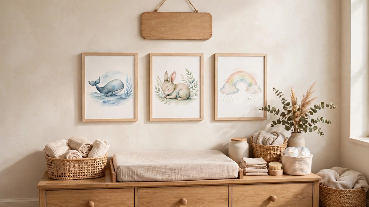
A child’s name on the wall is the nursery’s signature. Wooden letters are the classic — painted to match the scheme, or left natural against a colored wall — and they are light enough to mount with removable strips. Framed name prints with birth details (date, weight, length) double as keepsakes long after the nursery years.
Commissioned and custom options have become affordable: a watercolor of your home or street for the wall, a star map of the night they were born, a family tree print with the baby as the newest leaf. These pieces are the ones that move to the hallway or the child’s big-kid room later, carrying their value with them.
Balance the personalization. One or two name-focused pieces anchor the room’s identity; a wall of nothing but names and monograms tips into theme-park territory. Let the name art be the headline and the theme art be the supporting story.
Script matters more than parents expect. A flowing calligraphy name looks lovely to adults but means nothing to a child learning letters; a clean, simple typeface print doubles as early letter recognition. Many families do both — calligraphy for the keepsake piece, simple letterforms for the ones the child will actually read.
Gallery Walls for Nurseries: Composing the Mix
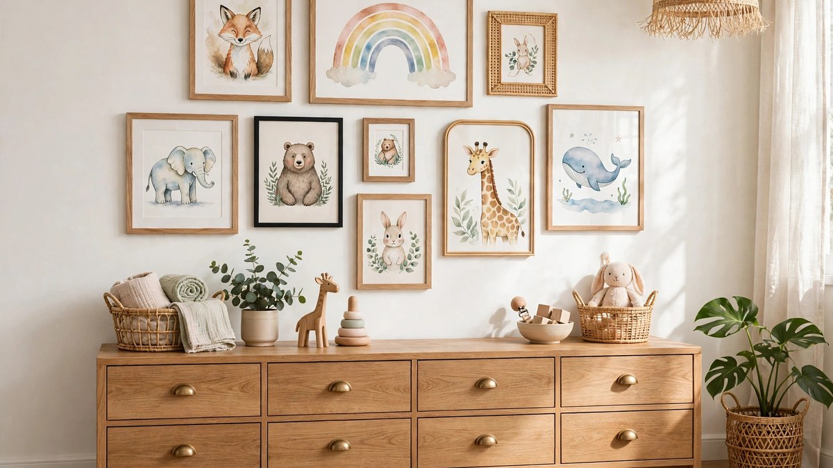
A gallery wall is the nursery’s most flexible format: prints, a small mirror, a woven hanging, a tiny shelf with a treasured object, all composed as one arrangement. Start with the largest piece, place it slightly off-center, and build outward with smaller pieces, keeping spacing consistent and edges roughly aligned.
Mix with intention: two or three colors repeated throughout, frames in one or two finishes, and a blend of art types — illustration, photograph, text print, texture piece. Odd numbers of elements tend to compose most easily. Nursery galleries shine above the dresser and changing area, where the baby gets a front-row view during every change.
The gallery’s secret advantage is growth. Add the handprint art, the first birthday photo, the preschool masterpiece as they arrive, swapping out the most babyish print each time. The wall matures with the child, and no single change ever requires a full redecoration.
Composition trick worth stealing: lay the whole arrangement on the floor first and photograph it from above. You will spot the awkward gaps, the two dark pieces clumping together, and the frame that fights the palette in seconds — all before a single hole goes into the wall.
High-Contrast Art for Newborn Eyes
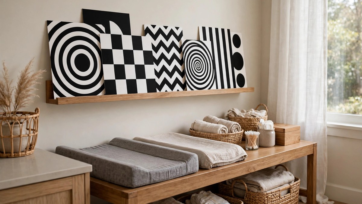
Newborns see the world in blur and contrast: bold black-and-white shapes, simple faces, and strong patterns are what their developing vision locks onto. A set of high-contrast cards or prints near the changing table is therefore both decor and developmental tool — babies will study them, calmly and at length, through many diaper changes.
Place contrast art where the baby actually looks: low beside the changing pad (within their early focal range of roughly 8 to 12 inches for close viewing, and visible from the table generally), or on the wall the crib faces. As vision develops over the first six months, softer color and finer detail become interesting, and you can rotate the gallery accordingly.
The practical format is a small set of swappable cards in a simple frame or on a ledge, so rotation takes seconds. It is the cheapest art in the nursery and, for the first half year, quite possibly the most loved.
Tummy time is the other viewing session to design for. A contrast print or an unbreakable mirror propped safely at floor level turns the daily exercise babies love to hate into a looking session they will actually tolerate. Rotate the floor-level art weekly and you will see fresh interest every single time.
DIY and Budget Nursery Wall Art
Beautiful nursery walls do not require a gallery budget. Framing pages from a beloved picture book — bought secondhand if you cannot bear to cut a new one — gives you genuine illustrator art for pennies, in matching series no one else has. Vintage children’s books are a goldmine here, and the results look intentional because they literally are book art.
Fabric is the other budget hero: a beautiful tea towel, a piece of patterned cloth stretched over a canvas frame, or an embroidered hoop set creates soft, safe, unbreakable art. Handprint and footprint canvases, made in an afternoon, become the pieces parents keep forever — schedule one for the newborn stage and one for the first birthday and you have a series.
Digital downloads deserve a mention: printable art files are inexpensive, arrive instantly, and print at home or a copy shop in any size. Combined with thrift-store frames — sanded and painted one color for a matched set — a full nursery gallery can come together for the price of one store-bought piece. For more whole-wall thinking beyond the nursery, our bedroom wall ideas carry many of the same tricks into grown-up rooms.
Art Above the Crib: The Safety Rules
The wall above the crib gets the most attention and needs the most caution. The non-negotiable rule: nothing heavy, glass-fronted, or loosely attached hangs where it could fall into the crib. Many parents sensibly keep that wall to paint, decals, or a securely mounted, lightweight canvas — the visual effect with none of the risk.
When you do hang framed pieces elsewhere in the nursery, choose acrylic glazing over glass. As the Wikipedia overview of picture frames explains, framing offers several glazing options including acrylic, which is lighter and shatter-resistant — exactly what a child’s room calls for. Secure frames with proper picture hardware or two-point fixings so they cannot be bumped askew or lifted off by curious hands later.
Mobiles follow their own rule: lovely over the crib in the early months, mounted securely, and removed once the baby can push up on hands and knees or reach the hanging parts. Treat every wall piece as something a determined toddler will eventually test, because they will.
Swapping Art as Your Baby Grows: A Simple Rotation System
Plan the growth path from the start and the nursery never needs a dramatic makeover. Keep frames and sizes consistent, store the “next stage” prints flat in a portfolio behind the dresser, and rotate seasonally or at milestones: contrast cards to soft color, soft color to detailed scenes, nursery rhymes to maps and alphabets.
Involve the child as soon as they can point. A low picture ledge with board books and a few art cards they can choose between gives toddlers ownership of their walls, and their choices will delight and surprise you. The gallery above stays yours; the ledge becomes theirs.
Photograph the wall at each stage. The nursery evolves so gradually you will not notice it happening, and a small series of wall photos becomes one of the sweetest records of how the room — and its resident — grew up together.
Common Mistakes to Avoid With Nursery Wall Art
- Hanging too high and too small. Nursery art marooned near the ceiling in tiny frames disappears. Go bigger, hang at eye level, group small pieces together.
- Glass over the crib. Use acrylic, canvas, or decals anywhere a frame could fall into the sleep space — and secure everything properly.
- All text, no images. Lettering prints are charming in ones and twos, but babies need images: faces, animals, shapes, and scenes feed developing eyes.
- Buying the whole matching set. Identical themed sets date quickly and cannot grow. Mix prints that share a palette instead of a product line.
- Forgetting the baby’s view. Art placed only for standing adults misses the audience lying in the crib and on the changing table. Angle some pieces for them.
- Skipping the template step. Nail holes are permanent; paper templates are not. Compose on the wall with tape first, always.
Each of these is a ten-minute fix before hanging — and an afternoon of patching if skipped.
Frequently Asked Questions
What size should nursery wall art be?
Above a crib or dresser, aim for an arrangement spanning about two-thirds the width of the furniture, which usually means hero pieces of 16 by 20 inches or larger, or a grouped gallery. Small single prints on large walls tend to look lost.
Is it safe to hang pictures above a crib?
Only lightweight pieces, securely mounted, and never glass-fronted frames. Many parents choose decals, paint, or a firmly attached unframed canvas for the crib wall and save framed art for other walls — the safest and simplest approach.
What art is best for a newborn’s development?
High-contrast black-and-white images with simple, bold shapes. Newborn vision responds best to strong contrast, so place these near the changing table or where the baby lies and looks. Rotate in soft color and detail as their vision develops over the first six months.
How many pieces should a nursery gallery wall have?
Five to nine pieces compose well for most nursery walls — enough for a rich mix, few enough to stay calm. Keep spacing even at about 2 to 3 inches and unify the mix with a shared palette and one or two frame finishes.
Can nursery art work for both a baby and a toddler?
Yes, if you choose subjects rather than baby-specific styling: animals, nature, maps, storybook illustration, and personalized pieces all span the years. Avoid art whose entire appeal is newborn-themed lettering, and rotate a few prints as milestones pass.
Where can I find affordable nursery wall art?
Printable digital downloads, pages from secondhand picture books, fabric stretched on frames, thrifted frames repainted as a set, and your own handprint canvases all deliver beautiful results for very little money.
When should I remove a mobile?
Remove it once your baby can push up on hands and knees or can reach and grab the hanging pieces — typically around the middle of the first year, though babies vary. When in doubt, take it down early; the wall art era has plenty to offer instead.
Conclusion
Nursery wall art is where safety, development, and storytelling meet on one wall. Size generously, hang at eye level, keep the crib wall lightweight and secure, feed newborn eyes with contrast, and choose subjects — animals, nature, stories, their own name — that will still mean something in three years. Build the wall that way, and your nursery wall art will grow up gracefully alongside the small person it was hung for.
Begin with the piece above the changing table — the hardest-working print in the house — and let the rest of the wall follow its palette and mood. One right piece makes every next decision easier, and a wall built piece by piece, with love, always beats a wall bought in a single matching box.
