
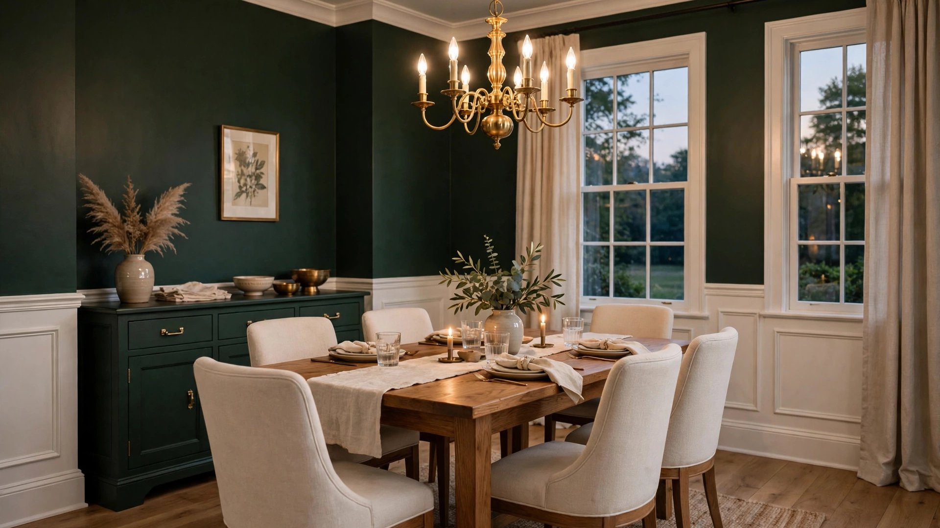

Of all the rooms in a house, the dining room is the one that forgives bold paint. It is used in short, social bursts, mostly in the evening, mostly by lamplight and candlelight, and it does not need to function as an office, a nursery, and a gym the way other rooms do. That freedom is why dining room wall paint ideas so often lead with drama: deep greens, inky blues, warm clays, and colors that would overwhelm a kitchen feel perfectly judged around a dining table.
It is also a room that rewards restraint in a different way. Because dining rooms are often small and furniture-filled, a considered neutral can look just as designed as a jewel tone, especially with wainscoting, art, and warm light doing their share of the work.
This guide covers the full spectrum, from safe warm neutrals to full color drenching, plus the trim, ceiling, and lighting decisions that make the wall color succeed. By the end you will have a shortlist matched to your room’s size, light, and furniture, and a testing method built for the hours when dining rooms actually get used: after dark.
Why Dining Rooms Can Handle Bolder Color
Three things make dining rooms the safest place in the house for strong color. First, you experience them at night. Artificial light warms and deepens paint, so shades that look daring at noon settle into rich, flattering tones by dinner. Second, you sit in them at one height, surrounded by furniture and people, so the walls are a backdrop more than a landscape. Third, meals are short. A color you might tire of across a whole workday stays exciting across a two-hour dinner.
The history of the room backs this up. The formal dining room has been a stage for display for centuries, from paneled Georgian rooms in deep reds and greens to today’s color-drenched spaces. Bold dining rooms are not a fad; they are the room returning to its original job.
Bold does not have to mean dark, either. A saturated mid-tone — a real terracotta, a confident sage, a proper peacock blue — reads bold at night while staying cheerful in daylight. If you are nervous, that mid-tone, full-commitment route is bolder in effect than a timid accent wall and easier to live with than near-black.
One more advantage: dining room furniture is usually warm. Wood tables, upholstered chairs, brass or black fixtures — the typical kit of parts flatters strong warm and deep cool colors alike, so the palette rarely has to fight the furniture.
Warm Neutrals for Everyday Dining
Not every dining room needs drama. If yours doubles as a homework station, a work-from-home overflow, or the only eating space in a small home, a warm neutral wall gives you flexibility: the room can host a Tuesday breakfast and a holiday dinner with equal ease.
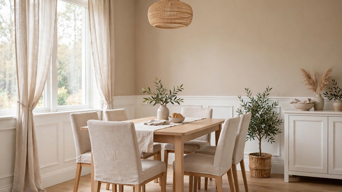
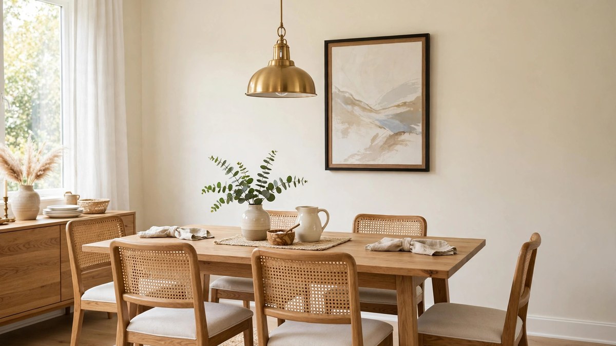
The best warm neutrals for dining sit a step deeper than living-room shades. Warm beiges, soft greiges, and mushroom tones have enough body to feel like a choice rather than a default, and they make wood tables glow. Pair them with a warm white ceiling and trim, then let a darker table, patterned rug, or upholstered chairs in a richer tone supply the contrast.
Warm neutrals also solve the open-plan problem gracefully. When the dining area shares space with the kitchen and living room, a warm neutral in the dining zone keeps the whole floor feeling connected, while place settings, a centerpiece, and pendant light supply the occasion.
If a warm neutral room ever feels plain, the answer is usually sheen and texture rather than new color. An eggshell or satin wall finish catches lamplight in a way flat paint cannot, and grasscloth, limewash-look paint, or even a large mirror will add the depth the room is missing.
Deep Greens and Blues for Drama
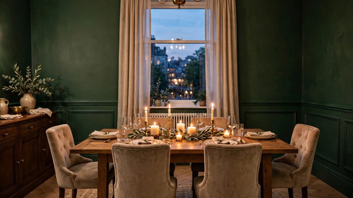
Deep green is the defining dining color of the moment, and for good reason. Forest, emerald, and deep sage walls make brass fixtures gleam, white china pop, and candlelight look expensive. Green also flatters food and faces, which is more than can be said for many colors. In a room with wainscoting, a deep green above and below the rail, fully drenched, is about as classic as modern dining gets.
Navy and inky blue run a close second. Blue dining rooms feel tailored and calm, and they pair with everything from farmhouse wood to chrome and glass. A blue with a green base (peacock, teal-navy) feels warmer at night than a blue with a violet base, which can turn chilly under LED light. Test both if you are deciding between them.
Deep colors demand two supports: light and lightness. Plan at least two light sources besides the chandelier — sconces, a buffet lamp, candles — because dark walls absorb light instead of returning it. And keep something pale in the room: chair upholstery, a light rug, or white trim for contrast, so the eye has relief and the room reads rich rather than cave-like.
Ceilings in deep dining rooms usually stay warm white to keep the room from closing in, though the color-drenching section below covers the bolder all-in option.
Rich Reds, Plums, and Moody Jewel Tones
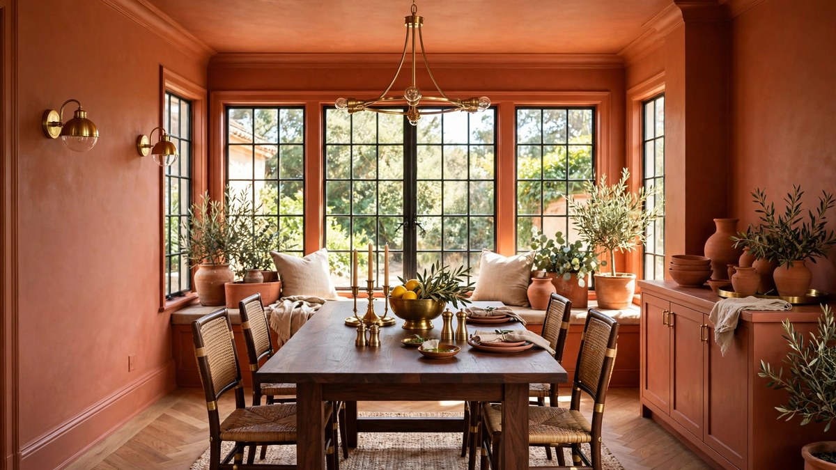
Red dining rooms have centuries of precedent because red is the color of appetite, ceremony, and warmth. Modern versions skip the bright primary reds of the past in favor of brick, oxblood, burgundy, and clay, shades with enough brown and gray in them to stay sophisticated at night. A brick-red dining room with black chairs and brass light is a room guests remember.
Plum and aubergine offer the same richness with a cooler soul. They flatter silver and chrome where reds prefer gold, and they make an elegant backdrop for art with warm tones, which glow against the purple. Keep plum’s companions warm — wood, cream, candlelight — or the room can turn cold and formal in the wrong way.
Other jewel tones worth sampling are topaz and amber for a golden, enveloping room, and teal for a jewel-box effect in small dining spaces. The jewel family shares one rule: commit. A watered-down jewel tone looks like a mistake, while the full-strength version, with trim and ceiling handled deliberately, looks like a boutique hotel.
Soft Whites and Creams That Glow at Night
White dining rooms sound plain until you see one done well in the evening. A warm white or cream wall reflects chandelier and candlelight back onto the table, makes food look vivid, and turns the room into a calm gallery for art, a patterned rug, or a dramatic table. For homes with colorful adjoining rooms, a white dining room also acts as a visual rest.
Choose warm whites over bright blue-whites here. Under evening bulbs, a cool white can look gray and empty; a warm white or true cream deepens into a glow. Cream, one step richer, suits traditional furniture and older homes particularly well and hides the scuffs of chair backs better than stark white.
White dining rooms need their interest from somewhere, so budget for it: a statement fixture, upholstered chairs with shape, art with presence, and textiles with texture. When those are in place, white walls stop being the absence of a decision and become the decision itself.
Two-Tone Walls and Color Drenching
Two-tone dining rooms split the wall at the chair rail or picture rail: deeper color below, lighter above, or the reverse. The classic version — color below, warm white above — grounds the room, hides chair scuffs where they actually happen, and keeps the upper room bright near the ceiling. It is also a kind way to use a bold color in a room you are still learning to trust.
Color drenching goes the other direction: one color on walls, trim, and sometimes the ceiling and doors, usually in slightly different sheens. In dining rooms, drenching in a deep green, navy, or warm mid-tone creates the enveloping, restaurant-like effect that is currently the most requested look in the category. Sheen becomes the only contrast: satin on trim, eggshell on walls, flat on the ceiling.
Both approaches reward a test patch that crosses the rail line or includes a piece of trim. Judging a two-tone or drenched scheme from wall swatches alone misses the interaction that makes it work. Our modern dining room ideas guide shows several of these schemes in finished rooms, which helps calibrate how far you want to go.
Paint Ideas for Wainscoting, Trim, and Ceilings
Dining rooms often carry the best millwork in the house, and paint is how you direct attention to it. The classic scheme paints wainscoting and trim in a crisp warm white and lets the upper wall carry the color. The white woodwork reads as architecture, and it earns the room a formal structure even in a casual house.
The inverted scheme is bolder: color on the wainscot, pale walls above. It suits rooms where the upper wall holds big windows or art, and it puts the color at the height of the table and chairs, where candlelight plays most.
For trim sheen, satin or semi-gloss is standard because it catches light along the molding profiles and survives chairs bumping into it. Ceilings, meanwhile, are a genuine opportunity in dining rooms. A warm white is safe; a soft blush, pale gold, or the wall color at 50 percent strength adds the kind of detail guests feel without identifying. The boldest move, a fully dark ceiling with dark walls, works in high-ceilinged rooms where the height can absorb it.
If your dining room has a tray or coffered ceiling, paint is practically the whole design budget. A shade deeper inside the coffers and warm white on the beams creates architecture-grade depth for the price of a gallon.
Small Dining Room Paint Ideas
Small dining rooms break the usual small-room rules in a helpful way: because the room is used at night and in company, it can carry deeper color than a small bedroom or bath. A saturated mid-tone or jewel shade can make a small dining room feel like a jewel box rather than a closet, especially with a mirror or glass-front cabinet returning the light.
If you prefer light and airy, the discipline is contrast control. Keep walls, trim, and ceiling in one warm light family so the eye is not stopped at every edge. Let the table and a patterned rug supply the depth, and choose a fixture with visual lightness, such as glass or open metalwork, so it does not crowd the ceiling.
Either way, avoid the middle mistake: a timid mid-tone with several competing accents. In a small dining room, pick a lane — enveloping and rich, or pale and seamless — because half-measures read as indecision at this scale. The space-saving layouts in our small dining room ideas guide pair well with both lanes.
Open-Plan Dining Areas
In an open plan, the dining area rarely has four walls of its own, so paint must zone without walls. The standard technique is one palette, two depths: the living zone in the lighter step, the dining zone in the same color one or two steps deeper, with the kitchen in a coordinating finish such as cabinet color. Because the hues agree in undertone, the floor feels unified while the dining “room” still reads as its own place.
A painted ceiling plane or a color-blocked wall behind the dining table can sharpen the zone further. So can keeping the dining walls drenched while the rest of the plan stays neutral, a move that makes dinner feel like an event inside the larger room.
What fails in open plans is temperature drift: warm greige living walls, a cool blue dining wall, and white kitchen cabinets fighting between them. Choose one undertone temperature for the whole floor and let depth, not hue, do the zoning.
Pairing Wall Color With Furniture, Art, and Lighting
Wall color is only half the dining room equation. The table is usually the largest object in the room, and its wood tone or finish sets the wall’s job. Dark walnut and mahogany tables love both deep walls, for a tonal cocoon, and warm whites, for contrast. Light oak and painted tables are more flexible but can look washed out against pale walls, so give them a mid-tone or deeper wall to stand against.
Art needs wall color that knows its place. A large painting with warm tones glows against deep green or warm greige; delicate watercolors and photography prefer quiet warm neutrals. If a major piece of art is staying, hold it against your finalist swatches. Designers genuinely choose wall colors this way, and it prevents the common disappointment of paint that argues with the art.
Lighting is the third partner, and the fixture over the table is the dining room’s jewelry. Our guide to over dining table lighting ideas covers shapes and hanging heights; for color purposes, remember that the fixture’s finish should echo your wall palette’s temperature — brass and black with warm and deep schemes, chrome and glass with cool or white ones. Bulb temperature matters just as much: 2700K bulbs warm every paint color in this guide by roughly one perceived step, which is either a feature or a surprise depending on whether you planned for it.
Upholstery and curtains are the flexible layer. If the walls are bold, keep fabrics quiet or tonal. If the walls are neutral, fabrics are your chance to bring the jewel tone in through chair seats, drapes, or a rug, all of which are far cheaper to change than paint when tastes move.
How to Test Dining Room Colors After Dark
Dining room testing breaks the usual rule. For most rooms you test in daylight and confirm at night; for dining rooms, reverse the priority. This room lives after dark, so judge your finalists at night first, under the actual fixture and bulbs you will use, ideally with candles or table lamps contributing the way they will at a real dinner.
Paint large swatches on two walls, including the one behind where guests will sit, since that is the wall in everyone’s eyeline across the table. Set the table, even roughly, with your dishes and a centerpiece. White china against a deep wall and a wood table in front of a pale one will teach you more in five minutes than a week of empty-room staring.
Then do one daylight check. A color that is glorious at night and merely fine at noon is a success for a dining room. A color that is glorious at noon and strange at night is a failure, no matter how good the photos look.
Buy all your paint at once after the night test, and if the room gets a two-tone or drenched scheme, sample the trim color beside the wall color on the same board. Their relationship is the design; test the relationship, not just the colors.
Mistakes to Avoid
The most common dining room mistake is timidity dressed as safety: a mid-tone beige chosen because it cannot offend, in the one room where personality costs the least. If you love a deep or saturated color, this is the room to use it, because the exposure is a few dinners a week, not a lifetime of workdays.
Second, avoid judging dining colors at noon. Midday light is the one condition the room rarely experiences in use, and colors chosen for it often disappoint at dinner. Third, forgetting the ceiling: a stark bright white ceiling over deep walls can chop the room’s height and undo the cocoon you paid for. Warm the ceiling white or carry the color thinking up.
Finally, do not let a bold wall color bully the rest of the budget. Deep walls need decent lighting and one or two pale companions to look rich. If everything else in the room is also dark and heavy, the result is a cave, and the paint will take the blame for a furnishing problem.
Frequently Asked Questions
What is the best paint color for a dining room?
For drama and compliments, deep green and navy lead current taste, while warm greige and soft cream are the safest all-purpose choices. The genuinely best color depends on your light and furniture: warm woods suit warm and deep palettes, while chrome, glass, and cool woods suit blue-grays and crisper whites. Test finalists at night before deciding.
Should dining room walls be dark or light?
Both work, and dining rooms are the rare space where dark is low-risk because the room is used briefly and mostly at night. Dark walls need good layered lighting and one or two light elements for contrast. Light walls need texture and a statement fixture to avoid feeling plain. Your furniture should tip the choice.
What finish is best for dining room walls?
Eggshell is the versatile default, catching lamplight softly while staying wipeable. Satin adds a little more glow and durability where chairs scrape. Wainscoting and trim usually take satin or semi-gloss to highlight the molding. Save flat finishes for ceilings, where they hide imperfections.
Can I paint my dining room ceiling a color?
Yes, and dining rooms are the best place to try it. A warm white is the safe classic, a paler tint of the wall color adds quiet sophistication, and matching the wall color exactly creates a color-drenched cocoon in high rooms. Just test the ceiling color lying flat under your evening light, since ceilings read darker than walls in the same shade.
How do I paint a dining room with wainscoting?
Choose the relationship first: color above with white wainscot is classic and formal; color below with pale walls above feels modern and grounds the room; one color over both, in different sheens, gives the drenched look. Sample the two zones together across the rail, because their contrast, or lack of it, is the whole effect.
What colors make a dining room feel cozy?
Warm and mid-to-deep colors feel coziest: terracotta, camel, warm greige at depth, deep sage, and burgundy. Cozy also depends on light, so pair the paint with warm bulbs, a dimmer on the main fixture, and soft materials like upholstered chairs and a rug under the table.
Should an open-plan dining area match the living room paint?
It should agree rather than match exactly. Keep one undertone temperature across the open floor and vary the depth: lighter in the living zone, a step deeper around the dining table, for example. That gives the dining area its own identity without the disjointed feeling that competing hues create.
Conclusion
Dining room wall paint ideas succeed when they are judged in the room’s real conditions: at night, around a set table, with the people and dishes that give the room its purpose. Deep greens, blues, and jewel tones reward the brave here more than anywhere else in the house, while warm neutrals and creams offer their own quiet kind of elegance.
Shortlist two or three colors, test them after dark, and handle the trim and ceiling as part of the same decision. Do that, and your dining room will stop being the room you walk through and become the room everyone remembers.
