
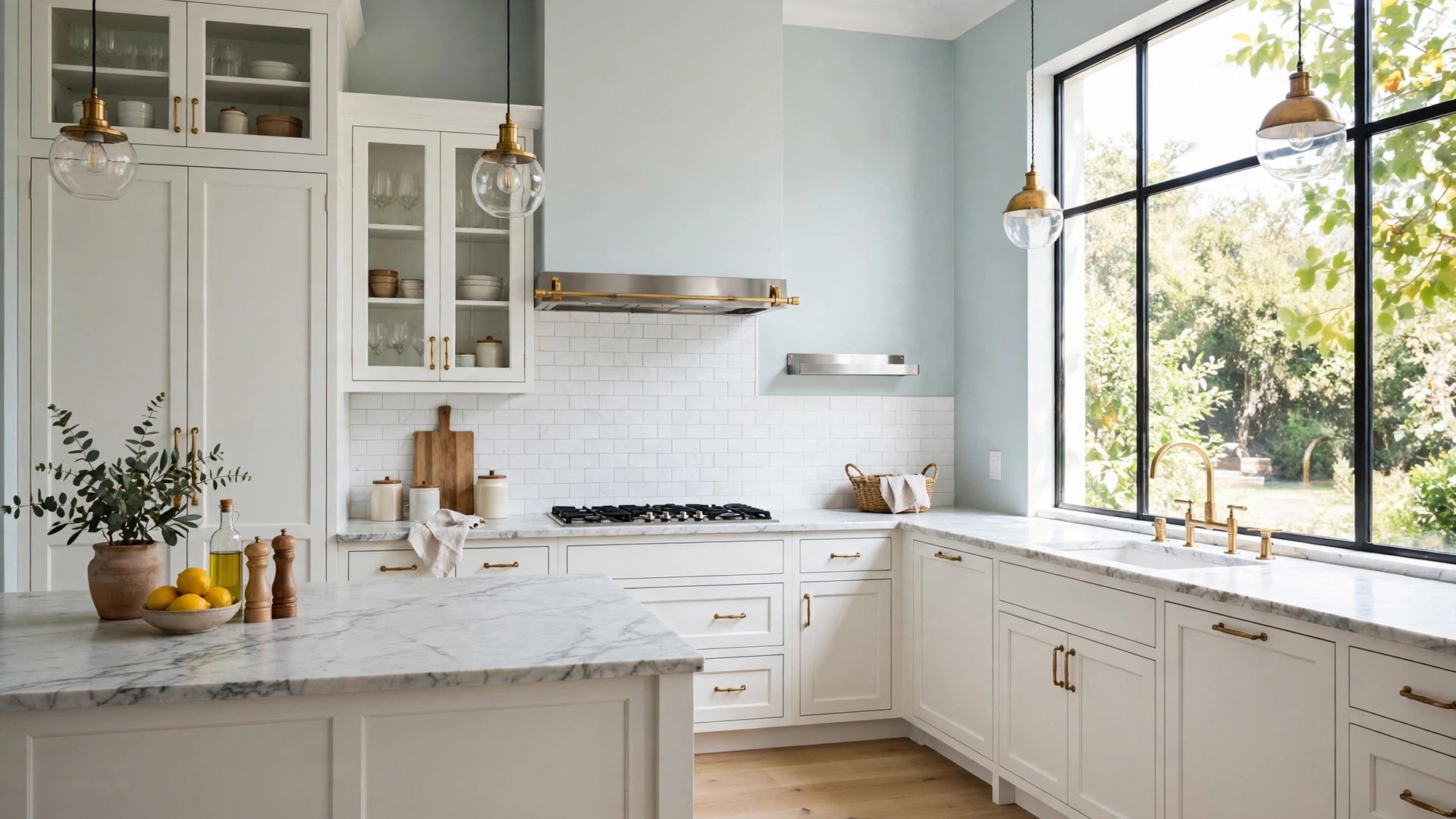

The kitchen is the hardest-working room in the house, and its paint has to do three jobs at once: survive steam and splashes, flatter the cabinets and counters you already own, and make the room feel like somewhere you want to linger over coffee. That is why choosing colors kitchen paint projects succeed or fail on rarely comes down to taste alone. It comes down to how the shade behaves against your fixed finishes and under your lights.
Unlike a bedroom, a kitchen gives you very little blank wall. Most of the visual field is cabinets, counters, backsplash, and appliances, so the paint color, on walls and often on the cabinets themselves, must be chosen as part of that system. The right color ties the whole system together; the wrong one makes expensive stone look off and good cabinets look tired.
This guide walks you through the system in the right order: light first, fixed finishes second, then the warm, cool, and classic palettes that work, including the special case of small kitchens. You will finish with a testing method that prevents the most common kitchen paint regret, which is a color that looked perfect on the chip and wrong everywhere else.
How Kitchen Light Changes Paint Colors
Kitchens have more kinds of light than any other room. Daylight pours through windows, recessed cans wash the ceiling, pendants pool light on the island, and under-cabinet strips throw a focused glow across the counters. Each source has its own temperature, and your paint color has to survive all of them.
Under-cabinet lighting is the sneakiest influence. Most strips run warm, around 2700K to 3000K, and they shine directly on the backsplash and lower walls, warming whatever color lives there. Meanwhile a north-facing window may be cooling the upper walls at the same moment. This is why the layered plan in our recommended kitchen lighting guide matters to paint choice: the fixtures you choose literally change the color you bought.
Color also interacts with appetite and mood more in kitchens than anywhere else. Research summarized in the color psychology literature notes that warm hues are associated with stimulation and appetite, while cool hues read as calm and clean. Neither is better, but it explains why buttery kitchens feel social and why blue-gray kitchens feel serene, and it is worth deciding which mood you are cooking in before you sample.
The practical rule: judge kitchen samples at breakfast, when daylight dominates, and again at dinner, when your artificial lights take over. A color that behaves in both shifts will behave every day you live with it.
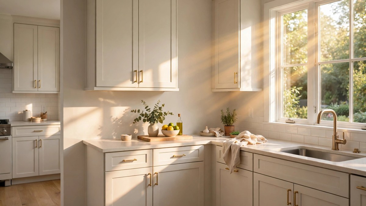
Start With Cabinets, Counters, and Floors
In most kitchens, the wall area is the smallest part of the picture, so the paint should be chosen to serve the biggest elements. Cabinets usually cover the most visual ground, counters carry the strongest patterns, and floors set the temperature for the whole room. List what is staying, note each item’s undertone, and let the paint fill the gaps.
Warm oak or walnut cabinets call for warm or balanced wall colors so nothing turns blue by contrast. White or gray cabinets open the door to cooler walls, but check the cabinet white’s own undertone first; a warm white cabinet against a cool wall color can look dingy. Our deep dive on kitchen cabinet colors walks the cabinet side of this decision in detail.
Counters demand a sample test, not imagination. Marble and quartz with gray veining pull wall colors cooler; granite with gold and brown flecks pulls them warmer; butcher block warms everything near it. Paint your sample board and lean it against the actual counter edge before judging.
Floors set the base note. Warm wood or terracotta floors plus warm walls can double up and feel heavy, so a slightly neutral wall often balances them. Cool gray floors plus cool walls can feel clinical, which a warm white wall quietly fixes. The paint is the cheapest element in the room; make it the diplomat.
Warm Kitchen Paint Colors
Warm kitchen colors — soft creams, buttery beiges, gentle terracottas, and warm whites — create the classic, welcoming kitchen most people picture. They flatter wood cabinets and floors, make stainless steel look less industrial, and glow under the warm task lighting kitchens use at night.
On walls, warm whites and pale warm beiges keep a kitchen bright without the blue edge that stark whites can bring to a food space. On cabinets, warm whites are the best-selling look in America for a reason: they read clean in daylight and creamy at night, and they pair with virtually every counter material sold.
Deeper warm shades have their place too. A muted clay or camel on a single wall, inside a breakfast nook, or on a kitchen island adds the coziness that all-white kitchens sometimes lack. Keep saturated warm colors off every wall in small kitchens, where their advancing effect can crowd the room.
One caution: warm paint plus warm bulbs plus warm wood can overshoot into yellow. If your sample looks golden under your under-cabinet lights, step the wall color one notch more neutral rather than lighter. Neutralizing, not brightening, is the correction.
Cool Kitchen Paint Colors That Feel Fresh and Clean
At the other end of the dial, cool kitchen paint colors — soft blues, blue-grays, pale sages with a cool cast, and crisp whites — deliver the fresh, clean feeling that suits modern and coastal kitchens. Cool walls make white cabinets look whiter, chrome and stainless look intentional, and marble counters look like they belong in a magazine.
Cool colors are particularly good in kitchens that run hot, literally or visually. A south-facing kitchen with big windows can take a cool wall color that would feel chilly elsewhere; the sun balances it for most of the day. Likewise, a kitchen full of warm wood benefits from a cool counterpoint on the walls or the island to keep the palette from going all one temperature.
Sage deserves a special note because it straddles the line: gray-greens with more blue read cool and serene, while those with more yellow read earthy and warm. Sample two sages side by side and you will see the family split.
The risk with cool kitchens is sterility. Warm them at the edges: a wood cutting board collection, woven stools, brass hardware, or a warm runner on the floor. Cool walls plus warm objects is one of the most reliable formulas in kitchen design.
Classic White and Cream Kitchen Walls
White kitchens endure because they solve several problems at once: they bounce light in a room where you need to see what you are chopping, they make small kitchens feel larger, and they let food, dishes, and people provide the color. The decision is never white versus color; it is which white, and that choice is undertone again.
Warm whites suit traditional kitchens, wood floors, and creamy stone. Cool and neutral whites suit modern kitchens, gray veining, and black accents. Cream, one step deeper than warm white, gives older homes and farmhouse kitchens a softness that pure white cannot, especially against wood beams and brick.
If your cabinets are white too, separate the layers with sheen and a half-step of depth. Walls a touch warmer or deeper than the cabinets, in eggshell against the cabinets’ satin, create a tailored look that reads deliberate rather than accidental.
White also demands honesty about maintenance. It shows splashes near the stove more than mid-tone colors do, which is an argument for quality washable paint in the cooking zone rather than an argument against white itself.
There is a resale argument too, and it is worth hearing even if you plan to stay. Real estate agents consistently describe light, neutral kitchens as the easiest to sell, because buyers can project their own style onto them. A white or warm-neutral kitchen rarely needs repainting before listing, while a highly personal color often does. That does not mean you should paint for a hypothetical buyer instead of yourself. It means that when you are torn between a safe white and a bold color you only like, the white carries a small practical bonus — and the bold color can still live on the island, the stools, or the wall art where changing it costs almost nothing.
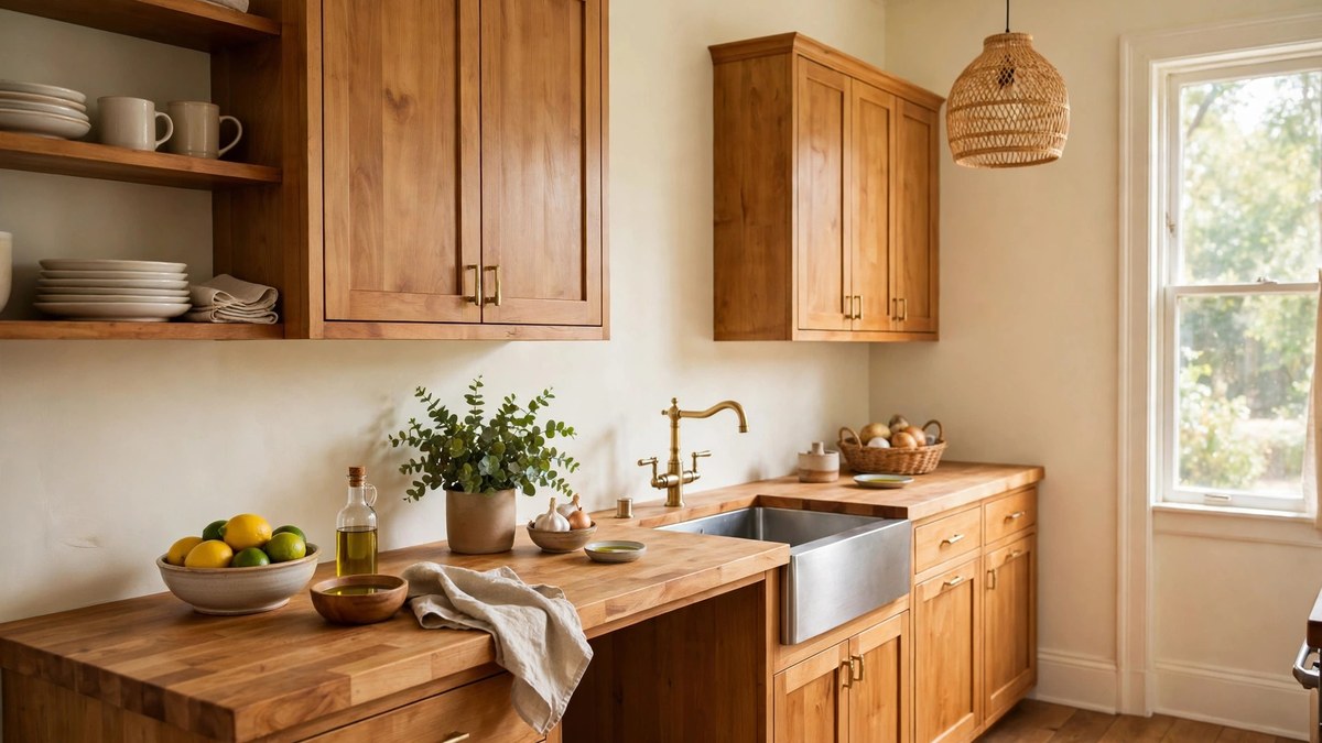
Sage and Green Kitchen Colors
Green has become the defining kitchen color story of the decade, and sage leads it. Sage cabinets under warm white walls, or sage walls behind white cabinets, both deliver color that feels grown-up and calm. Deeper greens — forest, olive, and hunter — create dramatic kitchens that pair with brass and marble for a tailored, almost restaurant-like mood.
Green’s great advantage is diplomacy. It sits between warm and cool, so it mediates between wood floors and gray counters better than almost any other hue. It also connects the kitchen to whatever is outside the window, which is why green kitchens photograph so beautifully in daylight.
Choose the depth by light. Bright kitchens can carry mid-tone and deep greens on cabinets without gloom. Dim kitchens should keep green lighter on walls or limit deep green to the island, where it reads as furniture rather than atmosphere.
Blue and Navy Kitchen Accents
Blue is the other classic kitchen color, from pale Wedgwood walls to navy islands and cabinets. Pale blues feel coastal and fresh with white counters. Navy delivers contrast and formality, and it is famously forgiving of the wear a busy kitchen island takes.
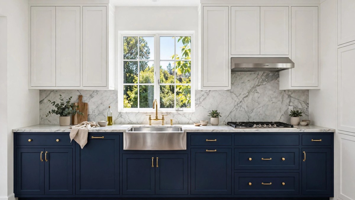
The most popular pattern of the last decade remains navy below and white above: navy base cabinets or island, white uppers and walls. It grounds the room, hides scuffs where feet and stools hit, and keeps the eye-level zone bright. Brass hardware against navy is the period detail that completes it.
If navy cabinets feel like a big commitment, test the color on the island only, or bring it in through the backsplash and stools first. Blue is also an excellent ceiling color in a white kitchen, a fifth-wall move that adds design confidence for the price of a gallon.
Two-Tone Kitchens: Pairing Wall and Cabinet Colors
Two-tone kitchens work because kitchens are naturally two zones: the cabinetry and everything else. The reliable formulas are few and forgiving. Darker below, lighter above is the most common, keeping weight at the floor and brightness at eye level. Color on the island with neutrals around the perimeter is second, and it lets you use a bold shade in a controlled dose.
Whatever the formula, keep the two tones in one temperature family. A warm navy island with warm white perimeter cabinets looks designed; a cool navy with creamy cabinets looks like a mismatch. Undertone agreement matters more than the specific hues. The layouts in our modern kitchen ideas guide show these pairings in complete rooms if you want to see the formulas at full scale.
Walls in a two-tone kitchen should be the quietest voice. Usually that means a warm or neutral white that matches the lighter cabinet tone’s family, so the cabinets provide the color story and the walls provide the light.
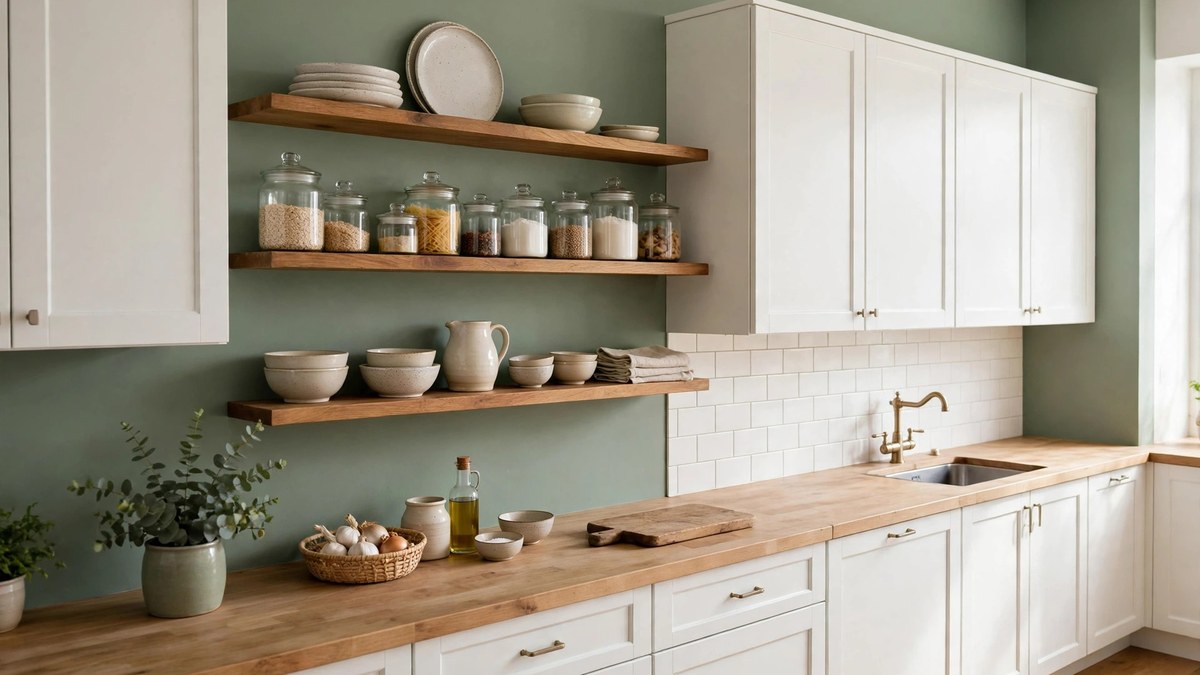
Paint Colors for Small Kitchens
Small kitchens follow different rules because light and visual space are scarce. Light colors on walls and cabinets remain the easiest way to make the room feel bigger: they reflect the limited light around and erase the contrast lines that chop a small room into pieces. Warm whites are usually better than cool ones here, because small kitchens are often short on windows and cool colors can turn them gray.
Monochrome is the small kitchen’s friend. When walls, cabinets, and even the backsplash stay close in value, the eye reads one continuous space instead of a patchwork. Add interest with texture — a handmade-look tile, wood stools, woven shades — rather than with extra colors.
If you crave color, take it deep on a small dose. A navy or forest island front, or a single short wall in terracotta, gives a small kitchen a designed focal point without shrinking the whole room. Keep the ceiling bright and the lighting warm, and the room will feel intentional rather than tiny.
Sheens and Finishes That Survive Kitchen Life
Kitchen paint takes more abuse than paint anywhere else: steam, grease mist, splashes, and frequent wiping. Finish choice is therefore functional, not just aesthetic. For walls, eggshell is the minimum; satin is safer in the cooking zone and around the sink, and quality modern paints make both scrubbable without the plasticky shine of old formulas.
Cabinets demand the most durable finish in the room. A satin or semi-gloss enamel made for cabinets and trim gives a hard, smooth film that survives knocks and cleaning. Flat and matte finishes on cabinets are a false economy; they scuff, absorb oils from hands, and cannot be washed back to clean.
Ceilings should stay flat to hide imperfections and avoid reflecting fixture glare downward. Backsplash-adjacent walls benefit from the same satin as the rest of the cooking zone. Whatever finish you choose, buy quality paint: in a kitchen, cheap paint is the most expensive option because you will apply it twice as often.
How to Test Kitchen Paint Colors
Kitchen testing has one extra step that other rooms do not: test against food light and fixed finishes, in the actual spots where paint will live. Paint large boards and move them around the room — against the cabinets, beside the counters, under the cabinets where the warm task light hits, and near the window.
Check the boards while you cook dinner. Steam, warm light, and activity are the kitchen’s real conditions, and a color that only works in an empty midday kitchen will disappoint you nightly. Also judge the sample beside your most-used items: the fruit bowl, the stand mixer, the dish towels. Kitchen color has more company than any other room’s paint.
Test cabinet colors on a spare cabinet door or a primed board stood vertically, never just on the wall. Horizontal chips and wall swatches read differently from a vertical cabinet face under your actual lights.
Mistakes to Avoid
The first mistake is choosing kitchen paint from the counter sample alone, or worse, from memory of the counter. Bring the stone or a large sample home, or take the paint boards to the stone. Undertones clash quietly: a wall can look fine until it stands next to the exact gray in your quartz.
The second is forgetting the fifth wall and the floor. A ceiling in the wrong white can yellow a whole kitchen from above, and warm floors under cool walls set up the daily argument this guide has been warning about. Decide the envelope as one palette.
Third, avoid trendy saturated colors on every cabinet in a kitchen you plan to keep. Cabinet painting is labor-intensive; put the boldest color where it is cheap to change — an island front, stools, or walls — and keep the full cabinet run in a shade you can love through several trends.
Finally, do not skip the dinner test. More kitchen paint regrets happen at 7 p.m. under warm light than at any other hour.
Frequently Asked Questions
What is the most popular kitchen paint color?
White remains the most popular kitchen color overall, especially warm and neutral whites on cabinets, because it maximizes light and pairs with every counter material. Sage green and navy have become the leading accent choices, most often on islands and lower cabinets, with greige and warm beige as the top wall alternatives.
Should kitchen walls match the cabinets?
They can, but a perfect match is not required and can look flat. A common approach is walls one step lighter, deeper, or warmer than the cabinets within the same undertone family, separated by sheen. What matters is that the two shades agree in temperature so neither makes the other look dirty.
What paint colors make a small kitchen look bigger?
Light, low-contrast schemes work best: warm white or pale greige on both walls and cabinets, a bright ceiling, and minimal value jumps between surfaces. Keeping finishes in one family and adding texture instead of extra colors stretches the space visually.
Are cool colors bad for kitchens?
Not at all. Cool colors feel fresh and clean and balance sunny or warm-wooded kitchens beautifully. They only disappoint in dim, north-facing kitchens where they can turn gray and chilly. In those rooms, choose the warmest version of the cool color you love, or warm the scheme with wood and brass accents.
What finish should I use for kitchen walls and cabinets?
Use eggshell or satin on walls, with satin preferred near the stove and sink, and a durable satin or semi-gloss cabinet enamel on cabinets. Flat finishes belong on the ceiling. Quality washable formulas matter more in kitchens than in any other room.
How do I choose between warm and cool kitchen colors?
Start with your fixed finishes. Warm floors and counters lean warm; gray stone, chrome, and black accents lean cool. Then check your light: hot, sunny kitchens can take cool colors, while dim kitchens usually need warm ones. When finishes and light disagree, pick a balanced neutral and let accessories carry the temperature.
Can I paint only my island a bold color?
Yes, and it is one of the smartest ways to use bold color. The island is a contained, furniture-like element, so repainting it later is a weekend job rather than a full kitchen project. Navy, deep green, and terracotta are the most popular island choices with neutral cabinets around them.
Conclusion
Choosing colors kitchen paint projects live with for years is a system, not a guess: read the light, respect the cabinets and counters you already own, then pick a palette family — warm, cool, classic white, green, or blue — and test it at breakfast and dinner. Do those steps in order and the color nearly chooses itself.
Start with two or three sample boards and a week of honest looking. The shade that flatters your stone, survives your task lights, and still makes you happy at dinner is the right one, whatever the trend charts say.
